Table of Contents
- Introduction
- Why Colour Matters in Corporate Attire
- Understanding Singapore’s Work Culture and Climate
- The Psychology of Colours in Professional Settings
- Best Colours for Different Corporate Environments
- How to Adapt Colour Choices for Singapore’s Tropical Weather
- Styling Tips for Men and Women
- Common Colour Mistakes to Avoid
- Building a Versatile Corporate Wardrobe
- Conclusion
1. Introduction
In Singapore’s modern business environment, first impressions matter more than ever. Your outfit is often the first thing people notice, and colour plays a powerful role in shaping that impression. The right colours can project confidence, authority, and professionalism — while the wrong ones can send mixed signals.
As Singapore’s work culture blends professionalism with a tropical climate, finding the perfect balance between comfort, sophistication, and colour harmony becomes essential. This article explores the best colours for corporate attire in Singapore’s unique context and how you can use them to enhance your professional image.
2. Why Colour Matters in Corporate Attire
Colour communicates before you even speak. In a business setting, it influences how others perceive your competence, trustworthiness, and confidence. Studies show that colours can subconsciously affect mood and decision-making — which is why companies invest in branding colours and dress codes.
For professionals, understanding which colours align with your skin tone and personality can create a polished, confident image that fits both your company culture and your personal brand.
3. Understanding Singapore’s Work Culture and Climate
Singapore’s work culture is a blend of traditional professionalism and modern creativity. While finance, law, and government sectors still lean towards conservative dress codes, industries like tech, design, and marketing embrace more flexibility.
Adding to that, Singapore’s tropical climate — warm, humid, and sunny — means heavy fabrics or dark tones can feel uncomfortable. The key is to strike a balance between smart and breathable, choosing colours that stay cool while looking refined.
4. The Psychology of Colours in Professional Settings
Here’s how common corporate colours are perceived in Singapore’s workplace:
| Colour | Meaning | Best For |
|---|---|---|
| Navy Blue | Authority, reliability, intelligence | Business meetings, presentations |
| White | Cleanliness, simplicity, trust | Everyday office wear, client-facing roles |
| Light Blue | Calmness, approachability | Customer service, HR, collaboration roles |
| Grey | Balance, neutrality, logic | Management roles, formal events |
| Beige/Tan | Warmth, stability | Smart casual settings |
| Black | Power, elegance, control | Formal events, leadership appearances |
| Soft Pink / Blush | Approachability, empathy | Creative industries, networking events |
| Muted Green | Balance, growth, innovation | Sustainability or tech sectors |
These subtle colour cues can make your outfit not only stylish but also psychologically aligned with your professional goals.
5. Best Colours for Different Corporate Environments
a. Formal & Traditional Industries
For finance, law, and consulting roles — stick with classic palettes like navy, charcoal grey, and crisp white. These project authority and precision without distraction.
b. Creative or Tech Startups
Modern companies in Singapore’s innovation scene appreciate individuality. Experiment with earth tones, muted greens, or dusty pinks to showcase creativity while keeping things professional.
c. Client-Facing Roles
If you work in real estate, marketing, or sales, wear colours that convey trust and energy — think light blue, beige, or soft coral. These tones make you appear open, friendly, and confident.
d. Corporate Events or Networking
When attending formal events or conferences, go for deeper shades like burgundy, navy, or black, accented with metallic accessories. These convey confidence and sophistication without being overpowering.
6. How to Adapt Colour Choices for Singapore’s Tropical Weather
Singapore’s hot and humid weather means comfort is just as important as style.
Here’s how to adapt:
- Choose breathable fabrics like cotton, linen, or lightweight blends.
- Opt for lighter tones such as cream, sky blue, or pastel grey to reflect heat.
- Avoid dark shades like solid black or deep maroon for daytime wear.
- Layer strategically with lightweight blazers or cardigans in air-conditioned offices.
- Keep it wrinkle-free — humidity can make fabrics crease easily, so choose structured materials.
By combining light fabrics with smart colour choices, you can look professional without sacrificing comfort.
7. Styling Tips for Men and Women
For Men:
- Pair navy trousers with light pastel shirts for a modern yet formal look.
- Add a textured grey blazer for air-conditioned offices.
- Use ties or pocket squares in contrasting tones like burgundy or teal to add personality.
- Avoid shiny fabrics — matte finishes look more professional.
For Women:
- Choose soft neutrals like beige, blush, or ivory for blouses and dresses.
- Layer with cool-toned blazers such as light grey or navy.
- Incorporate accessories in gold, silver, or muted jewel tones for elegance.
- Stick to matte fabrics that don’t cling or shine in humidity.
Small touches like nail polish, lipstick, and scarf colours can also harmonise your overall look and enhance your skin tone.
8. Common Colour Mistakes to Avoid
- Wearing overly bright colours (like neon orange or hot pink) — they distract from professionalism.
- Mixing too many colours in one outfit — limit yourself to 2–3 tones for balance.
- Ignoring undertones — the wrong shade of beige or grey can wash out your complexion.
- Wearing all-black daily — while sleek, it can feel heavy in Singapore’s climate.
- Skipping seasonal palettes — colours that suit your personal tone always elevate your appearance naturally.
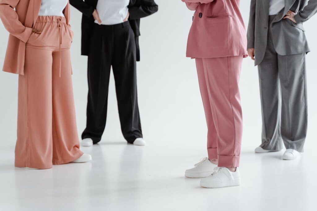
9. Building a Versatile Corporate Wardrobe
A well-curated wardrobe doesn’t need to be large — just smartly coordinated.
Start with these essentials:
- 2 neutral blazers (navy and beige)
- 3–4 shirts or blouses in light tones
- 2 pairs of trousers or skirts in complementary colours
- 1 formal outfit in darker tones for presentations or events
Add accent colours through ties, scarves, watches, or shoes to refresh your style without breaking the dress code.
10. Conclusion
Corporate dressing in Singapore is evolving — it’s no longer just about formality but also expression, comfort, and confidence. By understanding colour psychology and adapting your wardrobe to the tropical climate, you can effortlessly project professionalism while feeling your best.
Whether you’re attending a meeting in Raffles Place or networking at a Marina Bay event, remember: your outfit speaks before you do. Choose colours that align with both your environment and your personal palette — and let your wardrobe reflect your ambition and confidence.