Table of Contents
- Introduction
- Understanding Personal Colour Analysis
- Seasonal Colour Analysis Overview
- How Undertones and Contrast Affect Appearance
- Why Colour Matters for Special Occasions
- Enhancing Skin Tone and Features
- Creating Visual Harmony in Photos
- Selecting the Right Outfit Colours
- Weddings: Guest and Bridal Considerations
- Gala Dinners and Formal Events
- Festivals and Cultural Celebrations
- Matching Accessories and Makeup
- Jewellery, Shoes, and Bags
- Lipsticks, Blush, and Eye Makeup
- Coordinating Couples and Group Outfits
- Colour Harmony in Pairs and Groups
- Avoiding Clashes in Photos
- Adapting Your Palette to Singapore’s Lighting and Climate
- Natural Daylight vs. Event Lighting
- Humidity and Fabric Choices
- Sustainable and Ethical Choices for Special Occasions
- Renting and Upcycling Outfits
- Choosing Sustainable Fabrics
- Practical Tips for Shopping and Planning
- Local Boutiques and Designers
- Online Resources and Colour Consultations
- Trial Runs and Fittings
- Conclusion
- References and Further Reading
1. Introduction
Special occasions in Singapore, such as weddings, gala dinners, or festive events, demand careful attention to styling. Personal colour analysis provides a roadmap for selecting colours that enhance natural beauty and ensure that outfits look stunning in person and on camera. By aligning clothing, accessories, and makeup with your seasonal palette, you can achieve a cohesive and flattering appearance that boosts confidence and leaves a lasting impression.
2. Understanding Personal Colour Analysis
Seasonal Colour Analysis Overview
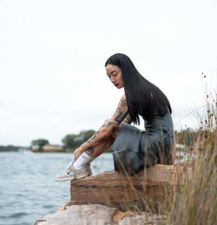
Seasonal colour analysis classifies individuals into Spring, Summer, Autumn, or Winter palettes based on skin undertones, hair colour, and eye colour. Each season includes colours that naturally complement your complexion and features.
How Undertones and Contrast Affect Appearance
Understanding whether your undertone is warm or cool, and your contrast level is high or low, helps in selecting colours that enhance your natural glow, especially for special events where photographs capture every detail.
3. Why Colour Matters for Special Occasions
Enhancing Skin Tone and Features
Wearing colours aligned with your seasonal palette brightens your complexion, highlights your eyes, and ensures makeup blends seamlessly.
Creating Visual Harmony in Photos
Coordinated colours prevent clashes and help you stand out elegantly in group photos, wedding portraits, or event photography.
4. Selecting the Right Outfit Colours
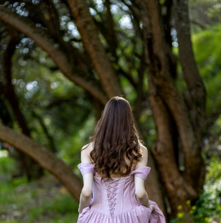
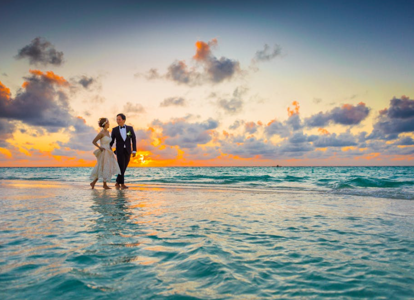
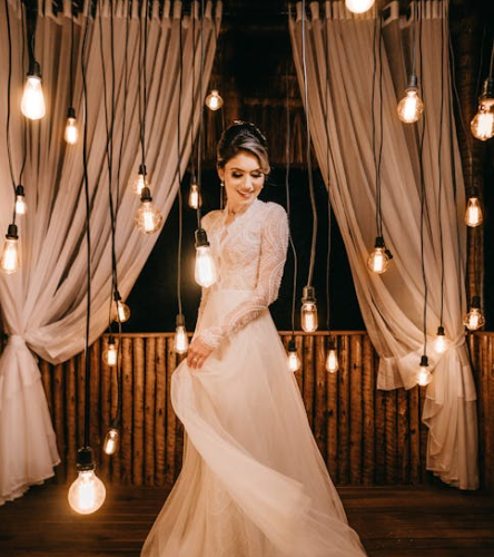
Weddings: Guest and Bridal Considerations
- Guests: Choose colours that complement the wedding theme while matching your palette. Avoid tones that wash out your complexion.
- Bridal Attire: For brides and grooms, seasonal colours can guide gown, suit, and accessory choices for a balanced, flattering appearance.
Gala Dinners and Formal Events
- Winter palettes can handle bold, high-contrast colours for dramatic impact.
- Summer palettes benefit from soft pastels or muted tones for refined elegance.
Festivals and Cultural Celebrations
- Incorporate vibrant, season-appropriate colours in harmony with traditional attire, enhancing both style and cultural expression.
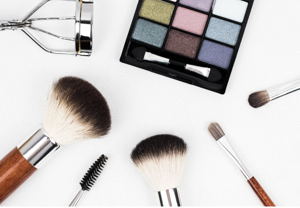
5. Matching Accessories and Makeup
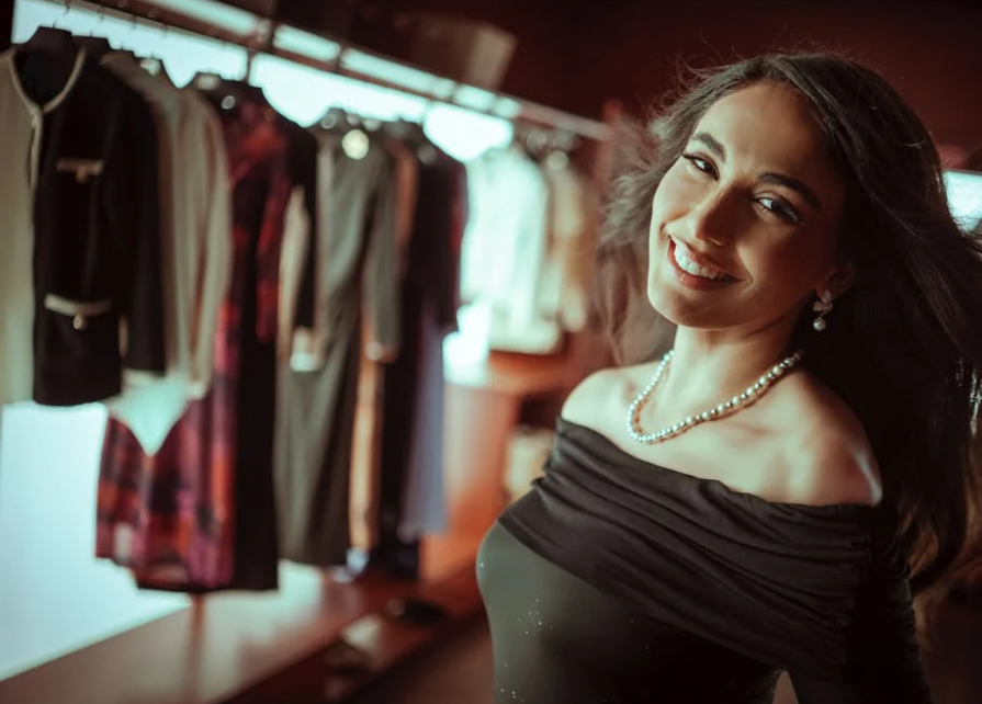
Jewellery, Shoes, and Bags
- Choose metals, gemstones, and leather accessories aligned with your palette.
- Consider statement pieces versus subtle accents depending on the event.
Lipsticks, Blush, and Eye Makeup
- Coordinate makeup shades with your seasonal palette to achieve a harmonious overall look.
- Spring palettes work well with warm corals and peaches, while Winter palettes suit bold reds and cool tones.
6. Coordinating Couples and Group Outfits
Colour Harmony in Pairs and Groups
- Use complementary palettes for coordinated appearances without exact matches.
- Couples can mix analogous or accent colours to maintain visual cohesion.
Avoiding Clashes in Photos
- Stick to the shared seasonal palette to ensure all individuals appear balanced and photogenic.
7. Adapting Your Palette to Singapore’s Lighting and Climate
Natural Daylight vs. Event Lighting
- Bright daylight can exaggerate contrasts; softer event lighting may require deeper or more saturated shades.
Humidity and Fabric Choices
- Opt for breathable fabrics like cotton, silk, or linen blends.
- Consider colourfast materials to maintain vibrancy in humid conditions.
8. Sustainable and Ethical Choices for Special Occasions
Renting and Upcycling Outfits
- Renting formalwear allows access to season-appropriate colours without long-term storage issues.
- Upcycling older outfits reduces waste and keeps your wardrobe fresh.
Choosing Sustainable Fabrics
- Organic cotton, bamboo, and recycled materials maintain your colour palette while supporting eco-conscious fashion.
9. Practical Tips for Shopping and Planning
Local Boutiques and Designers
- Seek designers in Singapore who specialize in seasonal colours and tailored fits.
Online Resources and Colour Consultations
- Virtual colour consultations and online boutiques can help you choose the right shades before visiting stores.
Trial Runs and Fittings
- Schedule fittings in proper lighting to assess how colours interact with your complexion.
10. Conclusion
Personal colour analysis is a valuable tool for navigating special occasions with confidence. By understanding your seasonal palette, you can make informed choices about clothing, accessories, and makeup that enhance your natural features, suit the Singaporean climate, and photograph beautifully. Whether attending a wedding, gala dinner, or festive celebration, your colour-savvy choices will ensure a cohesive and elegant look.
11. References and Further Reading
- Colour Analysis for Weddings: Choosing Outfits That Photograph Beautifully in Singapore’s Light – Learn more about applying seasonal colour analysis for weddings and other special occasions.
- The Science Behind Seasonal Colour Analysis: How It Works – Understand the principles of seasonal colour analysis to guide your styling choices.