Table of Contents
- Introduction
- Understanding Personal Colour Palettes
- Seasonal Colour Analysis Overview
- Importance of Undertones and Contrast Levels
- Why Accessories Matter in Personal Styling
- Accentuating Your Best Features
- Adding Depth and Dimension to Outfits
- Types of Accessories to Complement Your Palette
- Jewelry: Metals, Gemstones, and Colours
- Scarves, Belts, and Hats
- Bags and Footwear
- Eyewear and Watches
- Matching Accessories to Your Colour Season
- Spring: Light, Warm, and Vibrant Accents
- Summer: Soft, Cool, and Muted Tones
- Autumn: Rich, Earthy, and Textured Pieces
- Winter: Bold, Cool, and High-Contrast Elements
- Combining Accessories With Outfit Colours
- Coordinating With Clothing Patterns
- Balancing Bold Accessories With Neutrals
- Layering and Mixing Textures
- Special Occasion Styling
- Office and Corporate Settings
- Casual and Weekend Looks
- Festive Events and Parties
- Sustainable and Ethical Accessories
- Eco-Friendly Materials
- Supporting Local Singaporean Artisans
- Practical Tips for Shopping in Singapore
- Local Boutiques and Specialty Stores
- Online Platforms for Colour-Matched Accessories
- Assessing Quality and Longevity
- Conclusion
- References and Further Reading
1. Introduction
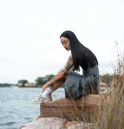
Accessories can dramatically transform an outfit, enhancing your overall appearance and helping you express your personal style. By choosing accessories that align with your personal colour palette, you ensure that each piece harmonizes with your natural tones and elevates your wardrobe. In Singapore’s vibrant fashion scene, understanding how to integrate seasonal colours into your accessories can give you a confident and polished look.
2. Understanding Personal Colour Palettes
Seasonal Colour Analysis Overview
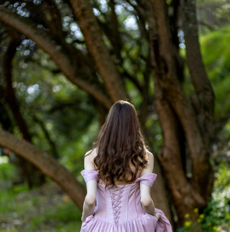
Seasonal colour analysis divides individuals into Spring, Summer, Autumn, and Winter categories based on skin tone, hair colour, and eye colour. Each season has a palette of colours that enhance natural beauty.
Importance of Undertones and Contrast Levels
Accessories that reflect your undertones and seasonal contrast level enhance your appearance, making your skin appear healthier and your features more defined.
3. Why Accessories Matter in Personal Styling
Accentuating Your Best Features
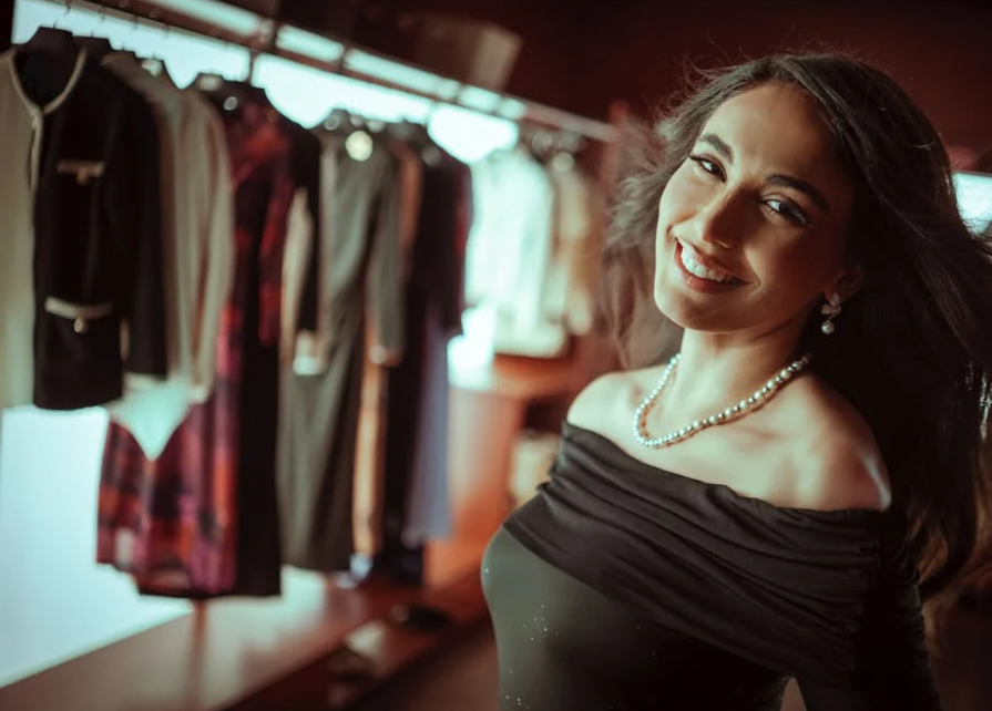
Accessories draw attention to key areas such as the face, neckline, or wrists. A well-chosen necklace, scarf, or pair of earrings can complement your natural colouring and highlight your best features.
Adding Depth and Dimension to Outfits
Layering accessories in complementary colours and textures creates depth, interest, and visual balance in your ensemble.
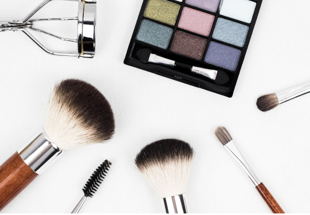
4. Types of Accessories to Complement Your Palette
Jewelry: Metals, Gemstones, and Colours
- Spring: Gold tones, warm gemstones like amber and coral.
- Summer: Silver or white gold, pastel gemstones like aquamarine and rose quartz.
- Autumn: Bronze, copper, and earthy gemstones like tiger’s eye or amber.
- Winter: Platinum or white gold, bold gemstones like sapphire, ruby, and emerald.
Scarves, Belts, and Hats
- Coordinate scarves and belts with your seasonal palette to add pops of colour or subtle complements.
- Hats can frame your face and emphasize your seasonal tones.
Bags and Footwear
- Shoes and bags in colours aligned with your palette reinforce cohesive styling.
- Consider neutral basics and statement pieces that reflect your season.
Eyewear and Watches
- Frame colours for glasses should harmonize with skin undertones.
- Watches can serve as both functional and stylish accent pieces that complement your palette.
5. Matching Accessories to Your Colour Season
Spring: Light, Warm, and Vibrant Accents
- Choose warm, bright, and cheerful shades like peach, coral, and soft yellow.
- Lightweight materials and natural textures work well in Singapore’s climate.
Summer: Soft, Cool, and Muted Tones
- Opt for pastel or muted shades such as lavender, powder blue, and soft pink.
- Silky fabrics and delicate metallics enhance the soft, romantic feel.
Autumn: Rich, Earthy, and Textured Pieces
- Embrace deep greens, burnt orange, mustard, and brown.
- Leather, suede, and wooden accents create warmth and richness.
Winter: Bold, Cool, and High-Contrast Elements
- Choose striking shades like royal blue, deep red, black, and crisp white.
- Structured, statement-making pieces complement high-contrast outfits.
6. Combining Accessories With Outfit Colours
Coordinating With Clothing Patterns
- Use your palette to select accessories that either blend or contrast strategically with patterned clothing.
- Avoid clashing by sticking within your seasonal palette.
Balancing Bold Accessories With Neutrals
- Pair statement pieces with neutral outfits to allow accessories to shine without overwhelming your look.
Layering and Mixing Textures
- Mixing metal types, fabric textures, and gemstone cuts adds depth while staying cohesive with your seasonal palette.
7. Special Occasion Styling
Office and Corporate Settings
- Choose refined, subtle accessories in colours aligned with your palette for a professional yet stylish appearance.
Casual and Weekend Looks
- Experiment with playful colours and textures that reflect your season, keeping comfort and practicality in mind.
Festive Events and Parties
- Layer statement jewellery, scarves, or bags that complement your seasonal palette for a striking, memorable look.
8. Sustainable and Ethical Accessories
Eco-Friendly Materials
- Opt for accessories made from recycled metals, organic fabrics, and sustainably sourced gemstones.
Supporting Local Singaporean Artisans
- Purchasing from local designers allows you to obtain unique, colour-aligned accessories while supporting sustainable practices.
9. Practical Tips for Shopping in Singapore
Local Boutiques and Specialty Stores
- Look for stores that offer curated collections aligned with seasonal palettes.
Online Platforms for Colour-Matched Accessories
- Many online retailers allow filtering by colour or provide virtual try-on tools to match your palette.
Assessing Quality and Longevity
- Check materials, construction, and durability to ensure your accessories remain stylish and functional over time.
10. Conclusion
Accessories are essential tools for enhancing your personal colour palette and elevating your overall style. By strategically selecting jewellery, scarves, bags, footwear, and eyewear that align with your seasonal colours, you can create cohesive, polished, and confident looks suitable for any occasion. Integrating these choices thoughtfully ensures your style is both flattering and enduring.
11. References and Further Reading
- How to Coordinate Jewellery with Your Personal Colour Palette – Explore tips on matching accessories with your seasonal colours for a harmonious and stylish appearance.
- The Science Behind Seasonal Colour Analysis: How It Works – Understand the principles of seasonal colour analysis to guide accessory and fashion choices.