A capsule wardrobe is a curated collection of versatile clothing pieces that coordinate effortlessly, reducing decision fatigue while enhancing your personal style. When combined with personal colour analysis, a capsule wardrobe ensures that every item complements your natural features, maximises outfit possibilities, and maintains a polished, cohesive look—especially important in Singapore’s dynamic urban and professional lifestyle.
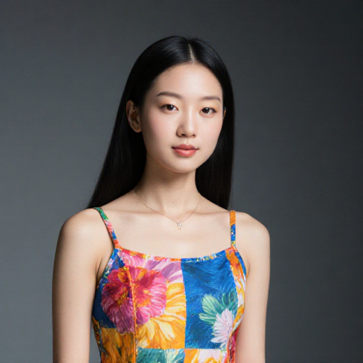
Table of Contents
- What Is a Capsule Wardrobe?
- The Role of Personal Colour Analysis
- Identifying Your Core Pieces
- Choosing Colours That Flatter Your Seasonal Palette
- Selecting Tops and Shirts for Maximum Versatility
- Pants, Skirts, and Dresses: Building a Cohesive Base
- Outerwear and Layering Options for Singapore’s Climate
- Accessories: Shoes, Bags, and Jewellery That Enhance Your Palette
- Maintaining and Refreshing Your Capsule Wardrobe
- Conclusion
1. What Is a Capsule Wardrobe?
A capsule wardrobe is a streamlined collection of clothing, typically consisting of 30–50 items, designed to mix and match easily. The focus is on quality, versatility, and longevity rather than fast fashion.
Benefits of a capsule wardrobe include:
- Less stress when choosing outfits
- Reduced clothing clutter
- Improved consistency in style
- Cost savings through thoughtful purchases
When paired with personal colour analysis, a capsule wardrobe ensures that every piece enhances your complexion, hair, and eyes, resulting in effortless harmony.
2. The Role of Personal Colour Analysis
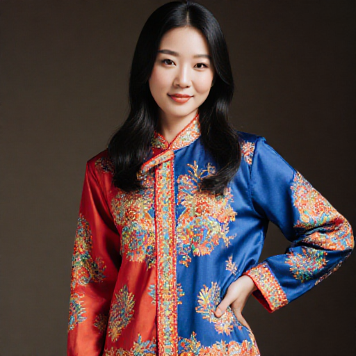
Personal colour analysis identifies your seasonal type—Spring, Summer, Autumn, or Winter—and determines which colours best complement your natural features.
By integrating this analysis into your capsule wardrobe:
- You can choose clothing that makes your skin glow and eyes pop
- Ensure all items coordinate naturally
- Minimise mismatched outfits and wasted purchases
A well-planned palette maximises your wardrobe’s potential, creating a versatile and polished image for both work and leisure.
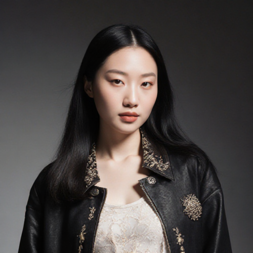
3. Identifying Your Core Pieces
Core pieces form the backbone of your capsule wardrobe. These items should be neutral, versatile, and suitable for multiple occasions:
- Blazers and Jackets: Neutral shades that coordinate with most outfits
- Trousers and Skirts: Choose cuts that suit your body type and palette
- Shirts and Blouses: Solid colours aligned with your seasonal palette
- Dresses: Classic styles that can be dressed up or down
Focus on quality fabrics and timeless cuts to ensure longevity and adaptability.
4. Choosing Colours That Flatter Your Seasonal Palette
Your seasonal palette guides colour selection across your capsule wardrobe:
- Spring: Light, warm, and bright tones—peach, coral, aqua
- Summer: Soft, muted pastels—lavender, soft blue, pale pink
- Autumn: Warm, earthy shades—olive, rust, mustard
- Winter: Cool, high-contrast colours—black, navy, emerald
Prioritise neutral base colours for core pieces, then incorporate accent colours for tops, scarves, or accessories to maintain versatility and interest.
5. Selecting Tops and Shirts for Maximum Versatility
Tops and shirts are the most frequently worn items in a wardrobe, so versatility is key:
- Choose classic cuts that suit both casual and professional settings
- Stick to seasonal colours to harmonise with your core pieces
- Incorporate patterns sparingly, ensuring they align with your palette
- Use layering pieces such as cardigans or vests to add depth without clashing
By selecting multi-functional tops, you can create a wide variety of outfits with fewer items.
6. Pants, Skirts, and Dresses: Building a Cohesive Base
Bottoms form the foundation of your capsule wardrobe:
- Trousers: Neutral shades such as black, grey, or navy for professional wear
- Skirts: A-line or pencil styles in your core palette offer flexibility
- Dresses: Choose classic silhouettes that transition from work to evening
- Consider fabric weight and drape for comfort in Singapore’s humid climate
A cohesive base ensures easy coordination with tops, outerwear, and accessories.
7. Outerwear and Layering Options for Singapore’s Climate
Despite the tropical climate, indoor air-conditioning can make layering necessary:
- Lightweight blazers and cardigans in neutral shades
- Sleeveless vests or jackets for transitional weather
- Fabrics that breathe yet maintain structure
- Layering items should match your seasonal palette to maintain visual harmony
Thoughtful layering ensures comfort while keeping your outfits stylish and coordinated.
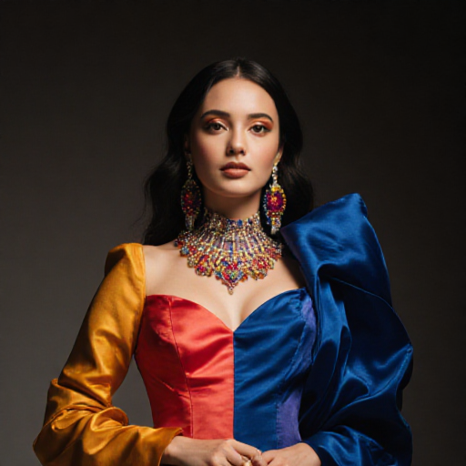
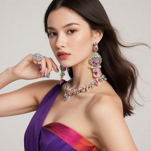
8. Accessories: Shoes, Bags, and Jewellery That Enhance Your Palette
Accessories can unify and elevate your capsule wardrobe:
- Shoes: Neutrals that match your core colours, with occasional accent pairs for variety
- Bags: Functional yet stylish bags in shades that complement your wardrobe
- Jewellery: Metals and stones that harmonise with your seasonal palette
- Scarves, belts, and ties can be used strategically to add pops of accent colour
Accessories complete your outfits and reinforce your personal colour harmony.
9. Maintaining and Refreshing Your Capsule Wardrobe
To keep your capsule wardrobe relevant and functional:
- Rotate pieces seasonally to account for weather and trends
- Remove items that no longer fit or suit your palette
- Invest in high-quality replacements when needed
- Consider how to refresh your wardrobe sustainably to extend the life of your collection
Regular maintenance ensures your capsule wardrobe remains versatile, stylish, and aligned with your personal colour palette.
10. Conclusion
Building a capsule wardrobe based on your personal colour palette streamlines dressing decisions, maximises outfit combinations, and enhances your professional and personal style. By selecting versatile pieces in colours that complement your natural features, you can create a cohesive, polished wardrobe that works for Singapore’s lifestyle and climate.
For more guidance on coordinating colours in your wardrobe, refer to How to Build a Capsule Wardrobe Based on Your Colour Season.