Table of Contents
- Introduction
- What Is a Seasonal Capsule Wardrobe?
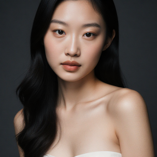
- Understanding Your Personal Colour Palette
- Singapore’s Climate and Its Effect on Colours
- Selecting Core Pieces for Your Capsule Wardrobe
- Transitioning Colours from Rainy to Sunny Months
- Fabrics That Work Across Seasons
- Accessorizing Your Seasonal Capsule Wardrobe
- Common Mistakes to Avoid
- How Virtual Colour Analysis Can Streamline Your Wardrobe
- Maintaining Versatility Without Sacrificing Style
- Conclusion
Introduction
In Singapore, where the climate alternates between sunny, humid days and occasional heavy rains, having a wardrobe that adapts to seasonal shifts is essential. A seasonal capsule wardrobe allows you to seamlessly transition your outfit colours and pieces from the rainy months to sunnier periods, ensuring comfort, style, and consistency throughout the year.
By incorporating insights from a professional colour analysis service Singapore, you can select pieces that flatter your natural tones while staying functional and stylish for all weather conditions.
What Is a Seasonal Capsule Wardrobe?
A capsule wardrobe is a curated collection of essential clothing items that mix and match easily. The seasonal version focuses on colours and fabrics suited to different weather patterns. Benefits include:
- Simplified outfit selection
- Reduced clutter and excess clothing
- Cohesive personal style
- Ability to adapt to weather changes while maintaining a polished appearance
A carefully planned capsule wardrobe can make dressing for work, social events, and casual outings in Singapore effortless.
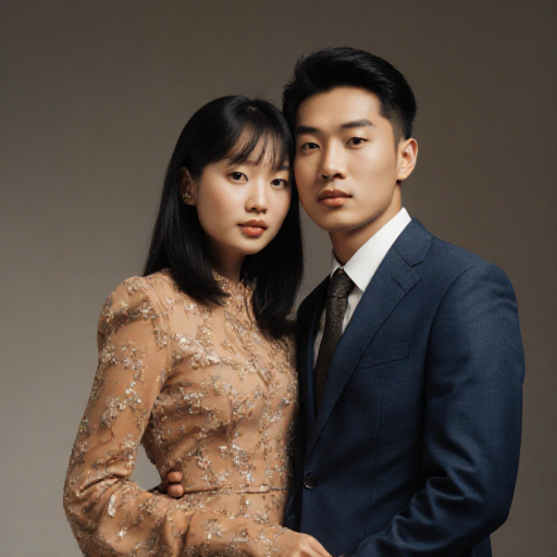
Understanding Your Personal Colour Palette
Your personal colour palette is a crucial factor in creating a capsule wardrobe:
- Determines which colours enhance your complexion
- Guides selection of versatile pieces that can mix and match easily
- Prevents clashes and maintains visual harmony
Using a colour analysis service helps identify your ideal shades, ensuring that all items in your capsule wardrobe work together seamlessly.
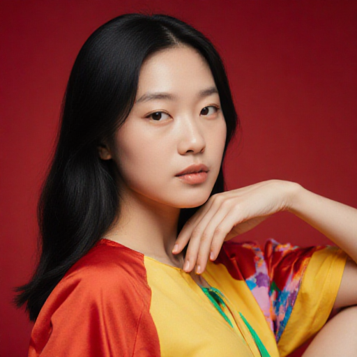
Singapore’s Climate and Its Effect on Colours
Singapore’s tropical climate influences how colours appear and feel:
- Sunny months: Bright daylight enhances vibrant colours, making pastels and jewel tones pop
- Rainy months: Overcast skies can mute colours, making deeper, warmer tones more flattering
- Humidity: Certain fabrics and colours may look different when damp or reflective
By selecting colours with these considerations in mind, your capsule wardrobe remains visually appealing and weather-appropriate.
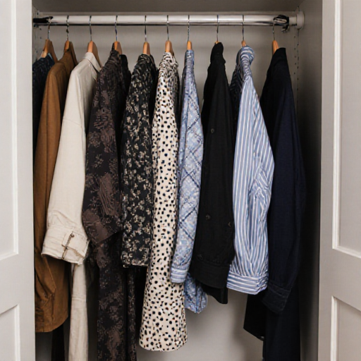
Selecting Core Pieces for Your Capsule Wardrobe
Core pieces form the backbone of a seasonal capsule wardrobe:
- Tops: Neutral shirts or blouses that can layer with brighter pieces
- Bottoms: Versatile trousers, skirts, or shorts in colours that complement your palette
- Outerwear: Light jackets or cardigans for rainy or cooler days
- Shoes: Neutral-toned footwear that pairs with multiple outfits
- Accessories: Scarves, belts, and bags in accent shades to add versatility
Choosing core pieces based on your personal colour palette ensures each item contributes to multiple outfit combinations.
Transitioning Colours from Rainy to Sunny Months
Transitioning colours effectively involves:
- Layering neutrals: Start with base neutrals like beige, grey, or navy and add seasonal accent colours
- Seasonal accents: Introduce brighter shades like coral, turquoise, or mint in sunny months
- Adjusting for mood: Darker, richer tones for rainy months evoke warmth; lighter shades for sunny months evoke freshness
- Mixing seamlessly: Use complementary tones from your palette to keep outfits cohesive
Strategically rotating colours ensures your wardrobe feels fresh and seasonally appropriate year-round.
Fabrics That Work Across Seasons
Fabric choice affects both comfort and colour perception:
- Cotton and linen: Breathable and ideal for sunny months
- Silk and light wool blends: Adaptable for rainy days while maintaining elegance
- Synthetic blends: Quick-drying for sudden downpours without compromising style
Selecting versatile fabrics ensures that your seasonal capsule wardrobe functions well regardless of the weather.
Accessorizing Your Seasonal Capsule Wardrobe
Accessories can adapt outfits across seasons:
- Scarves in versatile colours can add warmth and style in rainy months
- Jewelry in complementary tones enhances your seasonal palette
- Hats and belts can create cohesion while offering practical benefits for sun or rain
Accessories aligned with your personal colour palette elevate your overall look without overcomplicating your wardrobe.
Common Mistakes to Avoid
- Choosing colours based solely on trend, ignoring personal palette
- Selecting fabrics unsuitable for Singapore’s humidity
- Overloading your wardrobe with too many similar pieces
- Neglecting layering options for seasonal transitions
Avoiding these pitfalls ensures your wardrobe remains functional, stylish, and adaptable.
How Virtual Colour Analysis Can Streamline Your Wardrobe
Virtual colour analysis allows you to:
- Identify your best seasonal shades remotely
- Plan versatile capsule pieces without trial and error
- Receive guidance on colours that transition well between rainy and sunny months
This is a convenient way to optimize your wardrobe and maintain a cohesive, flattering appearance in Singapore’s climate.
Maintaining Versatility Without Sacrificing Style
- Focus on multipurpose pieces that pair with various colours
- Rotate accent colours seasonally to keep looks fresh
- Keep accessories in neutral or complementary tones for easy adaptation
This approach ensures that your capsule wardrobe remains practical while reflecting your personal style.
Conclusion
Creating a seasonal capsule wardrobe in Singapore allows you to transition smoothly between rainy and sunny months while staying stylish and comfortable. By leveraging a colour analysis service, you can select pieces and colours that enhance your natural features, maintain cohesion across outfits, and provide maximum versatility. With thoughtful colour selection, layering, and accessorizing, your seasonal capsule wardrobe will not only look polished but also adapt seamlessly to the demands of Singapore’s tropical climate.