Table of Contents
- Introduction
- Why Colour Matters for Wedding Guests
- Understanding Your Personal Colour Palette
- Choosing Colours That Complement the Wedding Theme
- Fabrics and Textures That Highlight Your Palette
- Coordinating Accessories With Your Outfit Colours
- Common Mistakes Wedding Guests Make
- Seasonal Considerations for Singapore Weddings
- How Virtual Colour Analysis Can Help
- Mixing Patterns and Prints for Elegance
- Maintaining a Polished Look From Day to Night
- Conclusion
Introduction
Attending weddings in Singapore offers a chance to showcase style while respecting cultural and aesthetic expectations. The colours you choose as a wedding guest can elevate your overall look, harmonize with the event, and ensure you appear confident and stylish. Understanding your personal colour palette is essential to make these choices effortlessly.
A professional colour analysis service Singapore can help you identify hues that enhance your natural features, ensuring that your outfit leaves a lasting impression at every wedding.
Why Colour Matters for Wedding Guests
Colours are more than just aesthetic choices—they communicate tone, mood, and sophistication. The right colours:
- Flatter your complexion and features
- Coordinate with the overall wedding theme
- Reflect elegance and confidence
- Avoid drawing unwanted attention away from the couple
In Singapore’s vibrant wedding scene, a strategic colour choice enhances both your appearance and your presence.
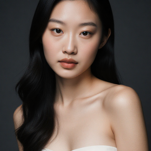
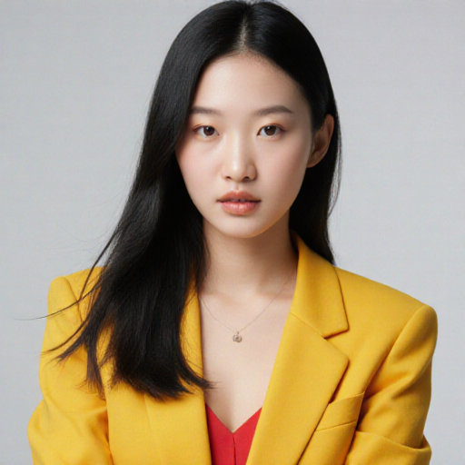
Understanding Your Personal Colour Palette
Your personal colour palette is determined by skin undertone, hair, and eye colour. Wearing colours that align with your palette:
- Brightens your complexion
- Enhances facial features
- Makes you appear vibrant and photogenic
For example, warm undertones may suit coral, gold, and olive shades, while cool undertones may shine in jewel tones like sapphire and emerald. Knowing your palette helps you select outfits that look polished and camera-ready.
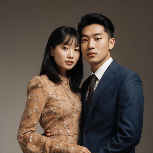
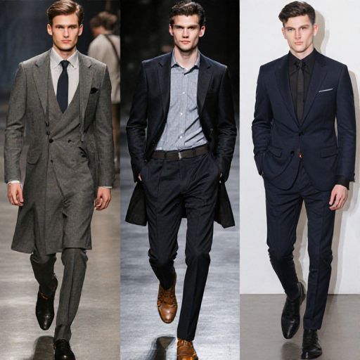
Choosing Colours That Complement the Wedding Theme
Singapore weddings may range from traditional ceremonies with vibrant reds and golds to contemporary events with soft pastels. Tips include:
- Coordinate, don’t clash: Align your outfit colours with the theme without overshadowing it
- Neutral balance: If the theme is bold, choose softer complementary hues
- Highlight accessories: Use accent colours for shoes, bags, or jewelry to enhance your palette
This ensures your outfit feels cohesive with the wedding environment.
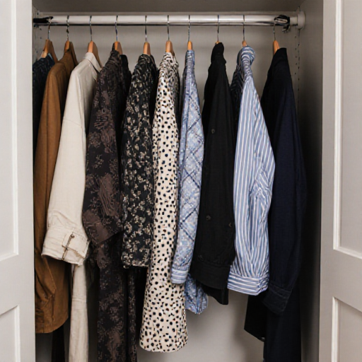
Fabrics and Textures That Highlight Your Palette
The right fabric enhances your chosen colours:
- Silk and satin: Reflect light beautifully and amplify jewel tones
- Chiffon and organza: Offer softness for pastels
- Matte fabrics: Ground bold colours and avoid shine overexposure on camera
Selecting fabric that complements your palette ensures that colours appear vibrant in both photos and in person.
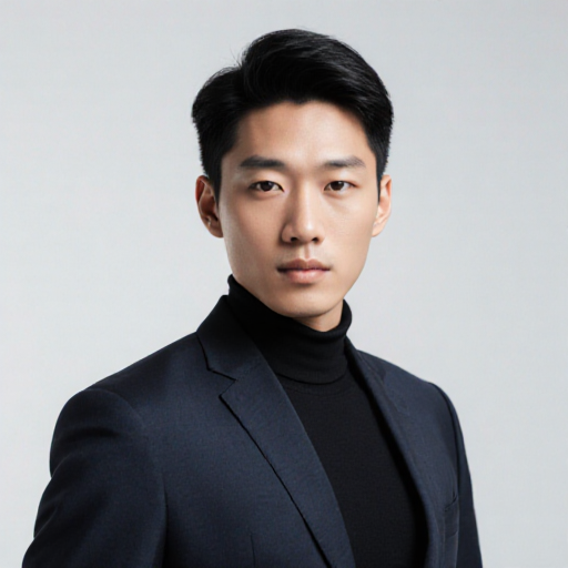
Coordinating Accessories With Your Outfit Colours
Accessories can tie your look together:
- Metallics should complement your undertones: gold for warm, silver for cool
- Scarves, belts, and shoes in accent colours add harmony
- Avoid clashing or overly bright accessories that distract from the outfit
Aligning accessories with your personal colour analysis ensures a polished and coordinated appearance.
Common Mistakes Wedding Guests Make
- Wearing colours that clash with the wedding theme
- Choosing shades that wash out your natural complexion
- Over-accessorizing or mismatching patterns
- Ignoring lighting and indoor/outdoor event settings
Being mindful of these mistakes ensures that your outfit enhances your overall presentation.
Seasonal Considerations for Singapore Weddings
Singapore’s tropical climate influences how colours appear:
- Bright daylight: Intensifies bold colours; pastels may appear washed out
- Indoor lighting: Warm indoor lights can shift tones
- Rainy season: Choose fabrics and shades that resist looking dull in humid conditions
Testing your outfit in different lighting helps maintain colour harmony during the event.
How Virtual Colour Analysis Can Help
Virtual colour analysis consultations allow you to:
- Identify your seasonal palette remotely
- Experiment with outfit colours before the wedding day
- Receive professional guidance on harmonizing with event themes
This is particularly useful for busy professionals or guests attending multiple weddings in Singapore.
For more insights, see our guide on how to build a capsule wardrobe based on your colour season in Singapore, which provides strategies for versatile outfits suitable for weddings and other occasions.
Mixing Patterns and Prints for Elegance
When wearing patterned outfits:
- Stick to one dominant colour and one or two accent shades from your palette
- Avoid high-contrast clashing patterns that overwhelm your features
- Incorporate neutrals to balance and unify prints
This approach maintains elegance while allowing creativity in outfit choices.
Maintaining a Polished Look From Day to Night
Singapore weddings may have ceremonies during the day and receptions at night. To maintain a cohesive look:
- Layer with neutral shawls or jackets to adjust formality
- Swap accessories like earrings or bags to enhance evening elegance
- Adjust makeup to complement colour choices and lighting
A strategic approach ensures that your outfit remains flattering throughout the event.
Conclusion
Choosing the perfect outfit colours for weddings in Singapore involves understanding your personal palette, coordinating with the theme, and selecting fabrics, textures, and accessories wisely. By leveraging a colour analysis service, you can confidently create a wedding guest wardrobe that is harmonious, elegant, and visually striking, ensuring you leave a memorable impression at every event.