Table of Contents
- Introduction
- Understanding the Basics of Colour Harmony
- The Role of Your Personal Colour Palette
- Choosing a Dominant Pattern
- Balancing Scale and Proportion
- Using Neutral Colours as Anchors
- Mixing Prints by Colour Family
- Incorporating Texture for Depth
- Common Mistakes to Avoid
- Final Thoughts
1. Introduction
Mixing patterns and prints is one of the most creative ways to express personal style, but it can easily go wrong without an understanding of colour harmony. For many people, combining florals, stripes, or checks seems intimidating — especially when trying to stay true to their colour season or palette. However, when you understand how patterns relate to your personal tones, you can create bold, cohesive looks that feel effortlessly stylish.
2. Understanding the Basics of Colour Harmony
Before you start pairing prints, it’s essential to understand colour harmony. Colours that share similar undertones naturally complement each other, while those that clash in temperature (warm vs. cool) can disrupt visual balance.
If you have a warm undertone, earthy tones like terracotta, mustard, and olive will blend better together than icy blues or greys. Conversely, if your undertone is cool, stick to jewel tones such as sapphire, emerald, or plum for a consistent, flattering effect.
A simple rule of thumb: keep all your prints within your colour season — your unique range of flattering hues. When the base tones of your prints are harmonious, the overall look will always feel put together, no matter how bold the patterns are.
To find out which undertones suit you best, it’s helpful to first identify your skin tone for perfect colour matching.
3. The Role of Your Personal Colour Palette
Your personal colour palette is a guide that ensures every item in your wardrobe complements both your skin tone and the rest of your clothing. This palette helps you determine whether a particular pattern or print aligns with your natural colouring.
For example, a Summer palette — featuring soft, cool, and muted colours — works beautifully with watercolour florals or subtle plaids. On the other hand, a Winter palette — rich in clear, vibrant tones — pairs well with bold stripes, polka dots, or graphic designs.
When mixing patterns, it’s not just about matching colours but also maintaining the visual balance between prints that suit your seasonal depth (light, medium, or dark).
4. Choosing a Dominant Pattern
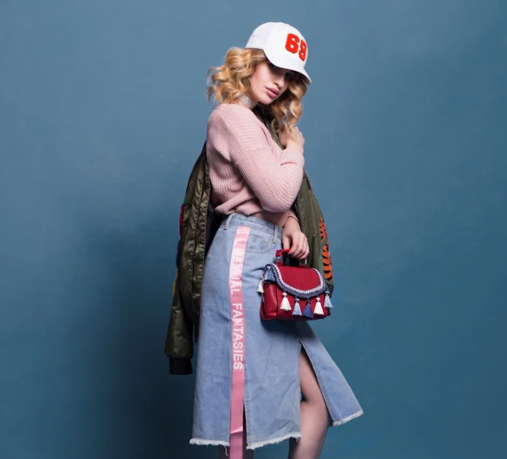
Every well-styled outfit has one dominant print and one or two supporting ones. The dominant print usually features your primary colours and covers the largest area of your outfit, such as a floral blouse or patterned skirt.
Supporting prints should be smaller or more subtle, complementing rather than competing. For instance, pairing a floral dress (large print) with a fine stripe scarf (small print) creates harmony while keeping the outfit visually interesting.
Avoid pairing multiple large, busy prints of equal intensity, as this can make your outfit feel overwhelming.
5. Balancing Scale and Proportion
One of the most overlooked aspects of mixing prints is scale. A successful pattern mix often relies on pairing prints of different sizes. For example, large florals with fine stripes or bold geometric shapes with tiny polka dots can create visual rhythm.
Scale also relates to body proportion. Petite individuals may find that smaller, closer-together patterns are more flattering, while taller figures can handle larger, more spread-out prints without looking crowded.
When in doubt, use one statement pattern and one neutral or smaller supporting pattern.
6. Using Neutral Colours as Anchors
Neutrals are your best friends when combining multiple prints. Shades like beige, cream, navy, grey, or black can serve as visual rest points in a busy outfit.
For example, pairing a printed blouse with neutral trousers or a plain blazer can balance out the complexity of patterns. You can also use neutral accessories — shoes, belts, or bags — to ground your look.
Neutral colours also help maintain sophistication, ensuring that even bold print combinations feel cohesive rather than chaotic.
7. Mixing Prints by Colour Family
If you’re new to mixing prints, start by staying within the same colour family. For instance, a combination of different shades of blue — such as navy stripes with baby-blue florals — feels coordinated and easy on the eyes.
Another trick is to repeat at least one colour from the first print in the second print. This creates a visual link that ties both pieces together. For example, if your skirt has pink and green floral prints, pair it with a striped top featuring one of those same shades.
This repetition technique helps even contrasting patterns look intentional and stylish.
8. Incorporating Texture for Depth
Print mixing isn’t limited to visual patterns — texture plays a key role, too. Combining fabrics like linen, silk, cotton, or denim adds depth without introducing extra colours.
For example, pairing a lace top with a tweed skirt or a silky blouse with a textured jacquard print allows you to experiment with pattern contrast in a subtle way. Texture can be your “silent print,” adding richness without overwhelming the outfit.
In Singapore’s warm climate, light fabrics like cotton or chiffon work best for layering patterns while staying comfortable.
9. Common Mistakes to Avoid
- Ignoring undertones: Warm and cool patterns don’t mix well; stick within your palette’s temperature.
- Too many bold prints: Two to three prints are the maximum before your outfit looks cluttered.
- Neglecting neutrals: Without a solid anchor, your patterns may visually compete.
- Forgetting context: Loud prints may work for casual settings but feel out of place in professional environments.
- Skipping balance: Avoid pairing multiple high-contrast patterns without at least one muted or grounding piece.
By paying attention to undertones, scale, and colour balance, you can avoid these pitfalls and build a more cohesive, stylish outfit.
10. Final Thoughts
Mixing patterns and prints doesn’t have to be intimidating. When guided by your personal colour palette, the process becomes creative and fun rather than risky. The key lies in understanding colour harmony, choosing one dominant print, and balancing scale with neutrals or textures.
The more you experiment within your seasonal palette, the more intuitive it becomes to identify what works. Remember, your wardrobe is an expression of your individuality — and with thoughtful colour coordination, even the boldest combinations can look effortlessly chic.
If you’re unsure which tones flatter your skin best, learn how to identify your skin tone for perfect colour matching. This foundation will help you mix prints confidently and stylishly for any occasion.