Coordinating outfits with your partner is an art that enhances not only visual appeal but also the perception of unity and style. In Singapore, where tropical lighting, indoor air-conditioned venues, and vibrant cultural events are common, understanding colour harmony is essential for couples who want to look their best for photoshoots, weddings, celebrations, or social gatherings. Integrating personal colour analysis ensures that both partners’ outfits complement their natural features while maintaining a cohesive look.
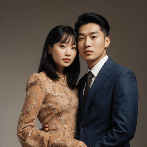
Table of Contents
- Understanding Colour Harmony in Couples’ Fashion
- The Role of Personal Colour Analysis for Each Partner
- Choosing a Colour Palette for Your Occasion
- Balancing Neutrals and Accent Colours
- Coordinating Patterns and Textures Without Clashing
- Accessory Coordination for a Polished Look
- Tips for Photoshoots and Social Events in Singapore
- Common Mistakes to Avoid in Couples’ Outfit Coordination
- Seasonal and Cultural Considerations
- Conclusion
1. Understanding Colour Harmony in Couples’ Fashion
Colour harmony in fashion is about creating a visual balance that is pleasing to the eye. For couples, this means selecting colours that:
- Complement each other without being overly matchy
- Highlight individual features while creating a cohesive visual impression
- Maintain versatility for multiple settings, from formal events to casual outings
Using colour theory, couples can combine complementary, analogous, or monochromatic shades to create outfits that are stylish and coordinated.
2. The Role of Personal Colour Analysis for Each Partner
Personal colour analysis identifies a person’s seasonal type—Spring, Summer, Autumn, or Winter—based on skin tone, hair, and eye colour. Applying this for both partners ensures that:
- Each partner’s outfit enhances their natural features
- Outfits look harmonious together, avoiding visual conflict
- Couples can choose accent colours that work for both, creating synergy
For example, a Winter-type partner may pair well with a Summer-type partner using complementary accent colours for balance.
3. Choosing a Colour Palette for Your Occasion
Selecting a colour palette depends on the type of event:
- Weddings: Soft pastels or muted tones for romantic and elegant looks
- Festivals and Celebrations: Vibrant, warm hues to reflect cultural vibrancy
- Photoshoots: Colours that contrast well with backgrounds and lighting, enhancing both subjects
It’s helpful to pick a primary palette for core clothing pieces and secondary accent colours for accessories, shoes, or outerwear.
4. Balancing Neutrals and Accent Colours
Neutrals form the foundation of any coordinated outfit:
- Black, white, beige, navy, or grey for core pieces like dresses, shirts, trousers, or jackets
- Accent colours to add personality and tie outfits together, such as scarves, ties, belts, or jewellery
- Maintain proportion: neutrals should dominate, accents should highlight
A thoughtful balance between neutrals and accents ensures harmony without overwhelming the eye.
5. Coordinating Patterns and Textures Without Clashing
Patterns and textures add depth but require careful coordination:
- Avoid bold patterns in both partners’ outfits at the same time
- Choose complementary textures, such as silk and linen, to create dimension
- Subtle prints in one outfit can be paired with solid colours in the other for balance
Effective pattern coordination maintains visual interest while preserving harmony.
6. Accessory Coordination for a Polished Look
Accessories complete the ensemble and reinforce colour harmony:
- Shoes, bags, belts, and watches in complementary shades
- Jewellery that complements both partners’ personal palettes
- Hats, scarves, or ties used strategically to unify or accentuate the look
By aligning accessory colours, couples create a polished, cohesive impression.
7. Tips for Photoshoots and Social Events in Singapore
- Lighting: Choose colours that work well under Singapore’s tropical sunlight and indoor lighting
- Venue Background: Avoid colours that blend into the environment; contrast for clarity
- Comfort: Lightweight, breathable fabrics for outdoor events; layer for air-conditioned spaces
- Coordinate, Don’t Match: Harmony is about complementing, not identical outfits
Following these tips ensures couples look stylish and feel comfortable during photoshoots or events.
8. Common Mistakes to Avoid in Couples’ Outfit Coordination
- Over-matching outfits, which can appear forced or artificial
- Ignoring personal colour analysis, resulting in outfits that clash with skin tones
- Combining too many patterns, creating visual chaos
- Choosing trendy colours over timeless, versatile shades
Avoiding these errors keeps couples looking elegant and coordinated effortlessly.
9. Seasonal and Cultural Considerations
- Tropical Climate: Light, breathable fabrics in colours that don’t fade under sun exposure
- Festivals: Incorporate culturally significant colours while maintaining harmony
- Seasonal Changes: Adjust palettes slightly to suit mood, temperature, or event style
Adaptation to seasonal and cultural contexts ensures comfort and style across various occasions in Singapore.
10. Conclusion
Coordinating couples’ outfits using colour harmony and personal colour analysis creates a polished, cohesive appearance that enhances photographs and event presence. By selecting complementary colours, balancing neutrals and accents, and coordinating patterns and accessories, couples can achieve visual synergy without looking overdone. For practical guidance on enhancing wardrobe coordination with your personal colour palette, explore Colour Harmony in Couples’ Outfits.