Table of Contents
- Introduction
- The Importance of Colour Analysis for Weddings
- Understanding Singapore’s Unique Lighting and Climate
- How Skin Undertones Influence Wedding Outfit Choices
- Selecting Flattering Colours for Brides and Grooms
- Colour Coordination for Guests and Bridal Parties
- Fabrics, Textures, and Their Impact on Photography
- Accessorizing While Maintaining Colour Harmony
- Common Mistakes to Avoid
- Conclusion
1. Introduction
Weddings are among the most photographed and memorable events in a person’s life. In Singapore, with its tropical sunlight and humid environment, choosing colours that complement both the couple and the guests is essential. Poor colour choices can appear harsh, washed out, or clash with the surroundings in photographs.
Personal colour analysis offers a systematic approach to selecting wedding outfits that flatter your natural undertones, harmonize with your partners’ attire, and photograph beautifully under Singapore’s bright lighting.
2. The Importance of Colour Analysis for Weddings
Colour analysis goes beyond aesthetic preference. It ensures that each participant in a wedding looks radiant, cohesive, and camera-ready. For the couple, the right colours enhance their features and evoke emotion; for guests, harmonious choices maintain a polished appearance without overshadowing the bride and groom.
By understanding your seasonal palette—Spring, Summer, Autumn, or Winter—you can select colours that naturally complement your skin tone and the wedding theme.
3. Understanding Singapore’s Unique Lighting and Climate
Singapore’s bright, tropical sunlight and high humidity create unique challenges for wedding photography:
- High brightness: Colours can appear lighter or washed out under direct sunlight.
- Reflections and glare: Shiny fabrics may create unwanted highlights in photos.
- Heat and humidity: Certain colours and fabrics can affect comfort and appearance throughout the day.
Choosing shades that maintain their vibrancy while balancing warmth and coolness is critical for both comfort and photographic appeal.
4. How Skin Undertones Influence Wedding Outfit Choices
Your skin’s undertone—warm, cool, or neutral—plays a pivotal role in selecting flattering wedding colours:
- Warm undertones: Golden, peachy, and amber shades enhance natural radiance.
- Cool undertones: Pink, berry, and jewel tones provide contrast and glow.
- Neutral undertones: Can wear a balanced mix of warm and cool tones, offering flexibility in outfit choices.
Understanding your undertone allows you to select shades that avoid washing out your complexion in photos.
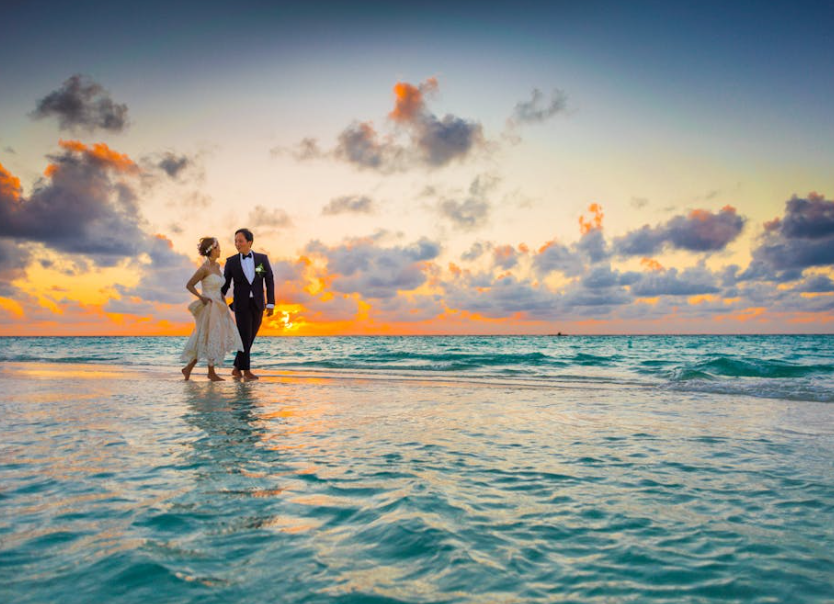
5. Selecting Flattering Colours for Brides and Grooms
Brides:
- Traditional whites and ivories may appear too stark against warmer undertones—opt for cream, champagne, or soft blush tones if your skin has warmth.
- Cooler undertones look stunning in icy whites, silver accents, or soft pastel shades.
- Seasonal colour palettes can guide subtle colour accents in embroidery, sashes, or accessories.
Grooms:
- Classic black or navy suits work universally but can be elevated with tie, pocket square, or boutonniere colours that harmonize with the bride’s palette.
- Lighter-toned suits (beige, soft grey) complement tropical climates but require attention to undertones to avoid looking washed out.
6. Colour Coordination for Guests and Bridal Parties
Guests should aim for outfits that harmonize with the wedding theme while avoiding colours that compete with the bridal couple.
- Group harmony: Coordinate colours within the bridal party to ensure cohesive photos without everyone wearing the exact same hue.
- Seasonal considerations: Choose shades from your seasonal palette that work well in bright outdoor settings.
- Avoid overpowering colours: Neon or overly saturated tones can dominate photos and clash with natural surroundings.
For guidance on pairing colours and coordinating outfits, explore strategies for coordinating styles for photoshoots.
7. Fabrics, Textures, and Their Impact on Photography
The choice of fabric and texture significantly affects how colours appear in photographs:
- Matte fabrics: Reduce glare and provide true colour representation under bright sunlight.
- Shiny fabrics: Silk, satin, or sequins reflect light, which can either enhance or distract from photographs depending on placement.
- Lightweight materials: Linen or chiffon helps with comfort in humid conditions while maintaining drape and elegance.
Mixing textures within the same colour palette adds depth to photos without overwhelming the overall aesthetic.
8. Accessorizing While Maintaining Colour Harmony
Accessories should enhance rather than compete with your main outfit:
- Jewelry: Choose metals that complement your undertone—gold for warm tones, silver for cool tones, and mixed metals for neutrals.
- Shoes and bags: Match or coordinate with your outfit’s accent colours for cohesive photos.
- Floral accents: Bouquets and boutonnieres can introduce complementary shades that unify the wedding party’s overall look.
Thoughtful accessorizing reinforces colour harmony and ensures everyone looks their best in group shots.
9. Common Mistakes to Avoid
- Wearing colours that clash with your undertone, leading to dull or washed-out appearances.
- Ignoring the tropical climate; heavy, dark fabrics can cause discomfort and affect posture and confidence.
- Overloading on bright or neon colours, which distract from the wedding couple in photographs.
- Failing to consider the reflective properties of fabrics under Singapore’s sunlight.
Avoiding these mistakes ensures both comfort and photogenic results.
10. Conclusion
Colour analysis for weddings in Singapore ensures that every participant—bride, groom, and guests—looks harmonious and radiant under tropical sunlight. By understanding undertones, selecting flattering shades, coordinating outfits, and choosing the right fabrics and accessories, you can enhance both your comfort and your photographic presence.
Careful colour planning guarantees that memories captured in photographs reflect not only the joy of the day but also a sophisticated, cohesive aesthetic. For additional guidance on ensuring visual harmony, refer to our tips on coordinating styles for photoshoots.