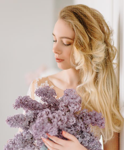
• Skip to primary navigation
  • Skip to main content
StyleUp

StyleUp

Personal Colour Analysis in Singapore

  • Home
  • Services
  • Blog

Colour Analysis

Office to Evening: How to Adapt Your Workwear Colours for After-Hours Events

October 9, 2025 by admin


Table of Contents

  1. Introduction
  2. The Importance of Colour Transition from Day to Night
  3. Understanding Your Base Colour Palette
  4. Choosing Versatile Foundation Pieces
  5. Using Accent Colours to Transform Your Look
  6. Layering Techniques for Effortless Transitions
  7. Accessorising with Evening-Ready Tones
  8. Makeup and Hair Adjustments for After-Hours Glamour
  9. Common Colour Mistakes to Avoid
  10. Final Thoughts

1. Introduction

In Singapore’s fast-paced lifestyle, transitioning seamlessly from a professional office environment to an after-hours event is an essential skill. Whether you’re heading to dinner, a networking event, or a casual social gathering, your outfit’s colours can make or break your impression. The key is learning how to work with your existing wardrobe pieces and adapt them using strategic colour combinations.

This guide will show you how to use your personal colour palette to move effortlessly from a formal setting to a stylish evening look — without a full outfit change.

Office to Evening: How to Adapt Your Workwear Colours for After-Hours Events

2. The Importance of Colour Transition from Day to Night

Colour plays a significant role in how we’re perceived. In the office, neutral and muted tones project professionalism, while deeper or bolder shades add sophistication for evening occasions.

During the day, colours like beige, navy, light grey, and soft pastels create a polished yet approachable look. When the sun sets, adding richness through jewel tones or metallic accents instantly shifts your appearance to evening-ready.

In Singapore’s vibrant cityscape — from the office towers of Raffles Place to the rooftop bars at Marina Bay — mastering this colour transition ensures you look appropriate and confident in every setting.


3. Understanding Your Base Colour Palette

The foundation of any successful work-to-evening transformation starts with your personal colour palette. If your undertones are cool, your wardrobe likely shines in shades of navy, plum, silver, or charcoal. For warmer undertones, opt for camel, coral, olive, or gold-based hues.

Keeping your outfits within your colour season ensures harmony throughout the day. For example, a soft summer palette might rely on dusty blues and rose tones, while a deep autumn palette thrives on burgundy and forest green.

When you understand which colours flatter your skin tone, you can confidently choose which pieces to highlight as you move from work to evening events. For guidance on colour selection in professional settings, explore colour choices for professional settings.


4. Choosing Versatile Foundation Pieces

Start your day with a base outfit that transitions easily. Think of a tailored sheath dress, a silk blouse paired with wide-leg trousers, or a pencil skirt and structured blazer. Stick to neutral base colours like black, navy, ivory, or taupe — these hues serve as a blank canvas for transformation.

Neutral foundations allow you to switch accessories, outerwear, or shoes later without worrying about colour clashes. They also adapt easily to different lighting conditions, remaining flattering under both fluorescent office light and evening ambiance.


5. Using Accent Colours to Transform Your Look

Accent colours are the quickest way to shift your outfit’s mood. During office hours, keep accents subtle — a light scarf, minimalist earrings, or nude heels. When evening comes, swap these for richer hues or metallic details.

For instance:

  • Replace a beige blazer with a deep emerald or navy jacket.
  • Trade your nude handbag for a burgundy clutch.
  • Add gold or silver jewellery that complements your undertone.

These small swaps introduce depth and vibrancy without compromising the professional foundation of your outfit.

If you know your seasonal palette, use your “signature evening shades” — the deeper tones within your range — to add elegance without overpowering your natural colouring.


6. Layering Techniques for Effortless Transitions

Layering is not only practical but also visually effective. A lightweight cardigan, cropped jacket, or silk shawl can completely change an outfit’s tone.

For instance, pair your office shirt with a dark velvet blazer for a refined dinner look. Alternatively, drape a patterned scarf in your accent colours to introduce sophistication without a full wardrobe change.

In Singapore’s humid weather, choose breathable fabrics like cotton, linen blends, or chiffon for layering. They allow flexibility without adding heat, keeping you comfortable during long days that turn into lively nights.


7. Accessorising with Evening-Ready Tones

Accessories are your secret weapon in colour transformation. The right jewellery or handbag can elevate a look instantly.

During office hours, minimalist jewellery in gold, rose gold, or silver works best. When it’s time for evening, upgrade to statement pieces — think gemstone earrings or layered necklaces that match your undertones.

Shoes are another effortless colour update. Swap neutral pumps for bold heels in deep red, navy, or metallic tones. If your base outfit is monochrome, even a pop of colour in your footwear can completely change the visual impression.


8. Makeup and Hair Adjustments for After-Hours Glamour

Colour transition doesn’t stop with clothing. Makeup and hairstyle adjustments help create a cohesive evening look.

During the day, natural tones like soft peach, nude, and taupe are ideal. For the evening, intensify your makeup with deeper lipstick shades such as berry or brick red and subtle shimmer on the eyelids.

When adjusting makeup, ensure your choices still align with your undertones — warm tones suit bronze or gold highlights, while cool tones pair beautifully with silver or mauve accents.

Even a quick change like loosening a bun or adding a pair of statement earrings can make you look instantly ready for an evening event.


9. Common Colour Mistakes to Avoid

  • Overcomplicating your palette: Too many competing colours can make your outfit appear disorganised. Stick to two or three complementary shades.
  • Ignoring undertones: A cool outfit base with warm-toned accessories often clashes subtly. Match metals and accents to your undertone for harmony.
  • Neglecting lighting: What looks balanced under bright office lighting may appear dull in evening light — always test your combinations.
  • Using stark contrasts: Avoid pairing extreme light and dark tones without a transition colour, as it may create a harsh visual break.

Avoiding these mistakes ensures your style transitions smoothly while maintaining elegance and consistency throughout the day.


10. Final Thoughts

Adapting your workwear colours for after-hours events is less about changing your outfit and more about strategic adjustments. By understanding your colour palette, choosing versatile base pieces, and introducing accent tones through accessories or layers, you can easily move from a professional setting to an evening atmosphere.

This flexibility not only saves time but also enhances your personal image — showing that you understand how colour influences perception in every environment.

For deeper insight into how your wardrobe colours impact professional impressions, revisit colour choices for professional settings. With a clear understanding of your personal palette and a few quick changes, you’ll always look polished, confident, and ready for any occasion.

Filed Under: Colour Analysis

How to Mix Patterns and Prints Without Clashing Your Colour Palette

October 4, 2025 by admin


Table of Contents

  1. Introduction
  2. Understanding the Basics of Colour Harmony
  3. The Role of Your Personal Colour Palette
  4. Choosing a Dominant Pattern
  5. Balancing Scale and Proportion
  6. Using Neutral Colours as Anchors
  7. Mixing Prints by Colour Family
  8. Incorporating Texture for Depth
  9. Common Mistakes to Avoid
  10. Final Thoughts

1. Introduction

Mixing patterns and prints is one of the most creative ways to express personal style, but it can easily go wrong without an understanding of colour harmony. For many people, combining florals, stripes, or checks seems intimidating — especially when trying to stay true to their colour season or palette. However, when you understand how patterns relate to your personal tones, you can create bold, cohesive looks that feel effortlessly stylish.

How to Mix Patterns and Prints Without Clashing Your Colour Palette

2. Understanding the Basics of Colour Harmony

Before you start pairing prints, it’s essential to understand colour harmony. Colours that share similar undertones naturally complement each other, while those that clash in temperature (warm vs. cool) can disrupt visual balance.

If you have a warm undertone, earthy tones like terracotta, mustard, and olive will blend better together than icy blues or greys. Conversely, if your undertone is cool, stick to jewel tones such as sapphire, emerald, or plum for a consistent, flattering effect.

A simple rule of thumb: keep all your prints within your colour season — your unique range of flattering hues. When the base tones of your prints are harmonious, the overall look will always feel put together, no matter how bold the patterns are.

To find out which undertones suit you best, it’s helpful to first identify your skin tone for perfect colour matching.


3. The Role of Your Personal Colour Palette

Your personal colour palette is a guide that ensures every item in your wardrobe complements both your skin tone and the rest of your clothing. This palette helps you determine whether a particular pattern or print aligns with your natural colouring.

For example, a Summer palette — featuring soft, cool, and muted colours — works beautifully with watercolour florals or subtle plaids. On the other hand, a Winter palette — rich in clear, vibrant tones — pairs well with bold stripes, polka dots, or graphic designs.

When mixing patterns, it’s not just about matching colours but also maintaining the visual balance between prints that suit your seasonal depth (light, medium, or dark).


4. Choosing a Dominant Pattern

Every well-styled outfit has one dominant print and one or two supporting ones. The dominant print usually features your primary colours and covers the largest area of your outfit, such as a floral blouse or patterned skirt.

Supporting prints should be smaller or more subtle, complementing rather than competing. For instance, pairing a floral dress (large print) with a fine stripe scarf (small print) creates harmony while keeping the outfit visually interesting.

Avoid pairing multiple large, busy prints of equal intensity, as this can make your outfit feel overwhelming.


5. Balancing Scale and Proportion

One of the most overlooked aspects of mixing prints is scale. A successful pattern mix often relies on pairing prints of different sizes. For example, large florals with fine stripes or bold geometric shapes with tiny polka dots can create visual rhythm.

Scale also relates to body proportion. Petite individuals may find that smaller, closer-together patterns are more flattering, while taller figures can handle larger, more spread-out prints without looking crowded.

When in doubt, use one statement pattern and one neutral or smaller supporting pattern.


6. Using Neutral Colours as Anchors

Neutrals are your best friends when combining multiple prints. Shades like beige, cream, navy, grey, or black can serve as visual rest points in a busy outfit.

For example, pairing a printed blouse with neutral trousers or a plain blazer can balance out the complexity of patterns. You can also use neutral accessories — shoes, belts, or bags — to ground your look.

Neutral colours also help maintain sophistication, ensuring that even bold print combinations feel cohesive rather than chaotic.


7. Mixing Prints by Colour Family

If you’re new to mixing prints, start by staying within the same colour family. For instance, a combination of different shades of blue — such as navy stripes with baby-blue florals — feels coordinated and easy on the eyes.

Another trick is to repeat at least one colour from the first print in the second print. This creates a visual link that ties both pieces together. For example, if your skirt has pink and green floral prints, pair it with a striped top featuring one of those same shades.

This repetition technique helps even contrasting patterns look intentional and stylish.


8. Incorporating Texture for Depth

Print mixing isn’t limited to visual patterns — texture plays a key role, too. Combining fabrics like linen, silk, cotton, or denim adds depth without introducing extra colours.

For example, pairing a lace top with a tweed skirt or a silky blouse with a textured jacquard print allows you to experiment with pattern contrast in a subtle way. Texture can be your “silent print,” adding richness without overwhelming the outfit.

In Singapore’s warm climate, light fabrics like cotton or chiffon work best for layering patterns while staying comfortable.


9. Common Mistakes to Avoid

  • Ignoring undertones: Warm and cool patterns don’t mix well; stick within your palette’s temperature.
  • Too many bold prints: Two to three prints are the maximum before your outfit looks cluttered.
  • Neglecting neutrals: Without a solid anchor, your patterns may visually compete.
  • Forgetting context: Loud prints may work for casual settings but feel out of place in professional environments.
  • Skipping balance: Avoid pairing multiple high-contrast patterns without at least one muted or grounding piece.

By paying attention to undertones, scale, and colour balance, you can avoid these pitfalls and build a more cohesive, stylish outfit.


10. Final Thoughts

Mixing patterns and prints doesn’t have to be intimidating. When guided by your personal colour palette, the process becomes creative and fun rather than risky. The key lies in understanding colour harmony, choosing one dominant print, and balancing scale with neutrals or textures.

The more you experiment within your seasonal palette, the more intuitive it becomes to identify what works. Remember, your wardrobe is an expression of your individuality — and with thoughtful colour coordination, even the boldest combinations can look effortlessly chic.

If you’re unsure which tones flatter your skin best, learn how to identify your skin tone for perfect colour matching. This foundation will help you mix prints confidently and stylishly for any occasion.

Filed Under: Colour Analysis

How Personal Colour Analysis Can Elevate Your Dating and Social Confidence

September 27, 2025 by admin


Table of Contents

  1. Introduction
  2. What Is Personal Colour Analysis?
  3. The Link Between Colour and Confidence
  4. How Wearing the Right Colours Affects First Impressions
  5. Best Colours to Enhance Your Natural Features
  6. Real-Life Scenarios: Colour and Attraction in Singapore’s Social Scene
  7. Tips for Choosing Date-Ready Outfits Based on Your Colour Season
  8. How to Apply Colour Analysis Beyond Clothing
  9. Common Mistakes to Avoid
  10. Conclusion

1. Introduction

In a city as vibrant and diverse as Singapore, making a strong first impression — whether on a date, at a social event, or during a networking dinner — often begins with how you look and feel. While many focus on style and grooming, the colours you wear play an equally important role in shaping how others perceive you.

Personal Colour Analysis (PCA) is more than a styling trend; it’s a proven method to help you choose colours that complement your natural skin tone, eye colour, and hair. By understanding your best shades, you can instantly appear more radiant, confident, and approachable — all key traits in dating and social settings.


2. What Is Personal Colour Analysis?

Personal Colour Analysis is a professional assessment that identifies which colour palette best enhances your natural features. Typically divided into four main seasons — Spring, Summer, Autumn, and Winter — each palette contains tones that bring out the warmth, depth, or brightness of your complexion.

For instance:

  • Spring: Warm and light tones — coral, peach, golden beige.
  • Summer: Cool and soft tones — lavender, sky blue, rose pink.
  • Autumn: Warm and deep tones — olive, rust, camel.
  • Winter: Cool and bold tones — navy, emerald, black, pure white.

By aligning your clothing and makeup with your seasonal palette, you naturally look more vibrant — no drastic makeovers required.


3. The Link Between Colour and Confidence

Colour has a psychological impact on how we feel about ourselves. When you wear colours that harmonise with your natural features, your skin looks brighter, your eyes stand out, and your overall energy feels more balanced. This visual harmony directly translates into self-assurance.

In social settings, confidence attracts people. You communicate better, smile more genuinely, and engage more comfortably when you feel good about how you look. This is why colour analysis is often a silent confidence booster — it helps you look effortlessly put-together without trying too hard.


4. How Wearing the Right Colours Affects First Impressions

Research shows that first impressions are formed within the first 7 seconds of meeting someone. Colours can subconsciously influence emotions and perceptions, especially during first dates or social events.

Here’s how different colours are commonly perceived:

ColourPsychological EffectBest For
RedPassion, confidence, attractionRomantic dates, evening events
BlueCalmness, reliability, comfortFirst meetings, casual dates
PinkWarmth, kindness, approachabilityDaytime outings
GreenFreshness, balance, growthOutdoor or nature dates
BlackPower, mystery, sophisticationFormal dinners, classy venues
WhitePurity, sincerity, simplicityCoffee dates, brunch settings

Choosing shades that flatter your skin tone within these colours enhances the psychological impact — making you appear naturally more confident and attractive.


5. Best Colours to Enhance Your Natural Features

Each skin undertone reacts differently to colours. Knowing your undertone helps you make smarter wardrobe choices:

  • Warm undertones: Gold jewellery looks great; earthy shades like terracotta, mustard, or coral bring out your glow.
  • Cool undertones: Silver jewellery suits you; opt for cool hues like lavender, cobalt blue, and fuchsia.
  • Neutral undertones: You can balance both — try jade green, rose, and soft grey.

In Singapore’s multicultural mix, undertones vary widely — but one universal truth remains: the right colours make you look more awake, refreshed, and confident even without makeup.


6. Real-Life Scenarios: Colour and Attraction in Singapore’s Social Scene

Let’s apply this concept to real-life situations:

  • First Date at a Café (Tiong Bahru / Dempsey): Soft tones like blush pink or baby blue project approachability and calm energy.
  • Evening Dinner at Marina Bay Sands: Deep jewel tones such as emerald, burgundy, or navy exude elegance and confidence.
  • Outdoor Event or Brunch: Light neutrals and pastel shades reflect sunlight beautifully and make you appear fresh and natural.
  • Networking Event: Muted blues or cool greys show professionalism while maintaining warmth — ideal for casual mingling.

Singapore’s warm lighting and humid weather also make breathable fabrics and soft matte colours more flattering than glossy or heavy materials.


7. Tips for Choosing Date-Ready Outfits Based on Your Colour Season

Spring Palette

  • Go for peach, coral, light turquoise, or ivory.
  • Avoid heavy blacks or dark browns.
  • Accessorise with gold or rose gold tones.

Summer Palette

  • Choose pastels like powder blue, soft lilac, and rose pink.
  • Avoid harsh contrasts like black and bright red.
  • Stick to silver or white-gold accessories.

Autumn Palette

  • Wear earthy shades — olive, burnt orange, camel, or rust.
  • Avoid icy blues or cool greys.
  • Complement with wooden or gold-toned accessories.

Winter Palette

  • Bold colours like emerald, navy, or magenta shine best.
  • Avoid warm yellows and oranges.
  • Silver or platinum jewellery enhances your tone perfectly.

By knowing your palette, you can easily plan date outfits that enhance your natural glow and boost your self-confidence.


8. How to Apply Colour Analysis Beyond Clothing

Colour analysis doesn’t stop at outfits — it extends to makeup, hair colour, and even accessories.

  • Makeup: Lipsticks and blush in your colour family make your complexion pop. For example, warm seasons look great in coral or peach, while cool seasons shine in rose or plum.
  • Hair Colour: Choose tones that complement your undertone — golden highlights for warm, ash or cool browns for cool.
  • Accessories: Scarves, watches, or even handbags in your palette subtly enhance your outfit’s harmony.

Consistency across these elements strengthens your overall image and makes you appear effortlessly coordinated.


9. Common Mistakes to Avoid

  1. Wearing trending colours that don’t suit you. Not every viral TikTok shade complements your undertone.
  2. Ignoring lighting. Singapore’s indoor warm lighting can distort how colours appear. Always check under natural light.
  3. Overusing neutrals. While safe, too many greys or blacks can dull your complexion.
  4. Mismatched makeup tones. Foundation or lipstick outside your undertone can clash with your clothes.
  5. Forgetting confidence. The best colour is one you feel powerful wearing — comfort amplifies charisma.

10. Conclusion

Personal Colour Analysis is a simple yet transformative tool for enhancing your dating and social confidence. In Singapore’s dynamic, image-conscious culture, understanding how colour works for you can set you apart instantly.

When your outfit complements your natural palette, it’s not just about looking good — it’s about feeling in control of how you present yourself. Whether you’re stepping into a first date, social event, or night out with friends, the right colours can help you radiate charm, authenticity, and confidence.

Your perfect colour isn’t about following fashion rules — it’s about revealing the best version of you.


Would you like me to write Topic 4: “The Ultimate Guide to Colour Analysis for Bridal and Pre-Wedding Styling in Singapore” next in the same 1000-word SEO format?


Table of Contents

  1. Introduction
  2. What Is Personal Colour Analysis?
  3. The Link Between Colour and Confidence
  4. How Wearing the Right Colours Affects First Impressions
  5. Best Colours to Enhance Your Natural Features
  6. Real-Life Scenarios: Colour and Attraction in Singapore’s Social Scene
  7. Tips for Choosing Date-Ready Outfits Based on Your Colour Season
  8. How to Apply Colour Analysis Beyond Clothing
  9. Common Mistakes to Avoid
  10. Conclusion

1. Introduction

In a city as vibrant and diverse as Singapore, making a strong first impression — whether on a date, at a social event, or during a networking dinner — often begins with how you look and feel. While many focus on style and grooming, the colours you wear play an equally important role in shaping how others perceive you.

Personal Colour Analysis (PCA) is more than a styling trend; it’s a proven method to help you choose colours that complement your natural skin tone, eye colour, and hair. By understanding your best shades, you can instantly appear more radiant, confident, and approachable — all key traits in dating and social settings.

How Personal Colour Analysis Can Elevate Your Dating and Social Confidence

2. What Is Personal Colour Analysis?

Personal Colour Analysis is a professional assessment that identifies which colour palette best enhances your natural features. Typically divided into four main seasons — Spring, Summer, Autumn, and Winter — each palette contains tones that bring out the warmth, depth, or brightness of your complexion.

For instance:

  • Spring: Warm and light tones — coral, peach, golden beige.
  • Summer: Cool and soft tones — lavender, sky blue, rose pink.
  • Autumn: Warm and deep tones — olive, rust, camel.
  • Winter: Cool and bold tones — navy, emerald, black, pure white.

By aligning your clothing and makeup with your seasonal palette, you naturally look more vibrant — no drastic makeovers required.


3. The Link Between Colour and Confidence

Colour has a psychological impact on how we feel about ourselves. When you wear colours that harmonise with your natural features, your skin looks brighter, your eyes stand out, and your overall energy feels more balanced. This visual harmony directly translates into self-assurance.

In social settings, confidence attracts people. You communicate better, smile more genuinely, and engage more comfortably when you feel good about how you look. This is why colour analysis is often a silent confidence booster — it helps you look effortlessly put-together without trying too hard.


4. How Wearing the Right Colours Affects First Impressions

Research shows that first impressions are formed within the first 7 seconds of meeting someone. Colours can subconsciously influence emotions and perceptions, especially during first dates or social events.

Here’s how different colours are commonly perceived:

ColourPsychological EffectBest For
RedPassion, confidence, attractionRomantic dates, evening events
BlueCalmness, reliability, comfortFirst meetings, casual dates
PinkWarmth, kindness, approachabilityDaytime outings
GreenFreshness, balance, growthOutdoor or nature dates
BlackPower, mystery, sophisticationFormal dinners, classy venues
WhitePurity, sincerity, simplicityCoffee dates, brunch settings

Choosing shades that flatter your skin tone within these colours enhances the psychological impact — making you appear naturally more confident and attractive.


5. Best Colours to Enhance Your Natural Features

Each skin undertone reacts differently to colours. Knowing your undertone helps you make smarter wardrobe choices:

  • Warm undertones: Gold jewellery looks great; earthy shades like terracotta, mustard, or coral bring out your glow.
  • Cool undertones: Silver jewellery suits you; opt for cool hues like lavender, cobalt blue, and fuchsia.
  • Neutral undertones: You can balance both — try jade green, rose, and soft grey.

In Singapore’s multicultural mix, undertones vary widely — but one universal truth remains: the right colours make you look more awake, refreshed, and confident even without makeup.


6. Real-Life Scenarios: Colour and Attraction in Singapore’s Social Scene

Let’s apply this concept to real-life situations:

  • First Date at a Café (Tiong Bahru / Dempsey): Soft tones like blush pink or baby blue project approachability and calm energy.
  • Evening Dinner at Marina Bay Sands: Deep jewel tones such as emerald, burgundy, or navy exude elegance and confidence.
  • Outdoor Event or Brunch: Light neutrals and pastel shades reflect sunlight beautifully and make you appear fresh and natural.
  • Networking Event: Muted blues or cool greys show professionalism while maintaining warmth — ideal for casual mingling.

Singapore’s warm lighting and humid weather also make breathable fabrics and soft matte colours more flattering than glossy or heavy materials.


7. Tips for Choosing Date-Ready Outfits Based on Your Colour Season

Spring Palette

  • Go for peach, coral, light turquoise, or ivory.
  • Avoid heavy blacks or dark browns.
  • Accessorise with gold or rose gold tones.

Summer Palette

  • Choose pastels like powder blue, soft lilac, and rose pink.
  • Avoid harsh contrasts like black and bright red.
  • Stick to silver or white-gold accessories.

Autumn Palette

  • Wear earthy shades — olive, burnt orange, camel, or rust.
  • Avoid icy blues or cool greys.
  • Complement with wooden or gold-toned accessories.

Winter Palette

  • Bold colours like emerald, navy, or magenta shine best.
  • Avoid warm yellows and oranges.
  • Silver or platinum jewellery enhances your tone perfectly.

By knowing your palette, you can easily plan date outfits that enhance your natural glow and boost your self-confidence.


8. How to Apply Colour Analysis Beyond Clothing

Colour analysis doesn’t stop at outfits — it extends to makeup, hair colour, and even accessories.

  • Makeup: Lipsticks and blush in your colour family make your complexion pop. For example, warm seasons look great in coral or peach, while cool seasons shine in rose or plum.
  • Hair Colour: Choose tones that complement your undertone — golden highlights for warm, ash or cool browns for cool.
  • Accessories: Scarves, watches, or even handbags in your palette subtly enhance your outfit’s harmony.

Consistency across these elements strengthens your overall image and makes you appear effortlessly coordinated.


9. Common Mistakes to Avoid

  1. Wearing trending colours that don’t suit you. Not every viral TikTok shade complements your undertone.
  2. Ignoring lighting. Singapore’s indoor warm lighting can distort how colours appear. Always check under natural light.
  3. Overusing neutrals. While safe, too many greys or blacks can dull your complexion.
  4. Mismatched makeup tones. Foundation or lipstick outside your undertone can clash with your clothes.
  5. Forgetting confidence. The best colour is one you feel powerful wearing — comfort amplifies charisma.

10. Conclusion

Personal Colour Analysis is a simple yet transformative tool for enhancing your dating and social confidence. In Singapore’s dynamic, image-conscious culture, understanding how colour works for you can set you apart instantly.

When your outfit complements your natural palette, it’s not just about looking good — it’s about feeling in control of how you present yourself. Whether you’re stepping into a first date, social event, or night out with friends, the right colours can help you radiate charm, authenticity, and confidence.

Your perfect colour isn’t about following fashion rules — it’s about revealing the best version of you.


Filed Under: Colour Analysis

Best Colours for Corporate Attire in Singapore’s Work Culture

September 25, 2025 by admin


Table of Contents

  1. Introduction
  2. Why Colour Matters in Corporate Attire
  3. Understanding Singapore’s Work Culture and Climate
  4. The Psychology of Colours in Professional Settings
  5. Best Colours for Different Corporate Environments
  6. How to Adapt Colour Choices for Singapore’s Tropical Weather
  7. Styling Tips for Men and Women
  8. Common Colour Mistakes to Avoid
  9. Building a Versatile Corporate Wardrobe
  10. Conclusion

1. Introduction

In Singapore’s modern business environment, first impressions matter more than ever. Your outfit is often the first thing people notice, and colour plays a powerful role in shaping that impression. The right colours can project confidence, authority, and professionalism — while the wrong ones can send mixed signals.

As Singapore’s work culture blends professionalism with a tropical climate, finding the perfect balance between comfort, sophistication, and colour harmony becomes essential. This article explores the best colours for corporate attire in Singapore’s unique context and how you can use them to enhance your professional image.

Best Colours for Corporate Attire in Singapore’s Work Culture

2. Why Colour Matters in Corporate Attire

Colour communicates before you even speak. In a business setting, it influences how others perceive your competence, trustworthiness, and confidence. Studies show that colours can subconsciously affect mood and decision-making — which is why companies invest in branding colours and dress codes.

For professionals, understanding which colours align with your skin tone and personality can create a polished, confident image that fits both your company culture and your personal brand.


3. Understanding Singapore’s Work Culture and Climate

Singapore’s work culture is a blend of traditional professionalism and modern creativity. While finance, law, and government sectors still lean towards conservative dress codes, industries like tech, design, and marketing embrace more flexibility.

Adding to that, Singapore’s tropical climate — warm, humid, and sunny — means heavy fabrics or dark tones can feel uncomfortable. The key is to strike a balance between smart and breathable, choosing colours that stay cool while looking refined.


4. The Psychology of Colours in Professional Settings

Here’s how common corporate colours are perceived in Singapore’s workplace:

ColourMeaningBest For
Navy BlueAuthority, reliability, intelligenceBusiness meetings, presentations
WhiteCleanliness, simplicity, trustEveryday office wear, client-facing roles
Light BlueCalmness, approachabilityCustomer service, HR, collaboration roles
GreyBalance, neutrality, logicManagement roles, formal events
Beige/TanWarmth, stabilitySmart casual settings
BlackPower, elegance, controlFormal events, leadership appearances
Soft Pink / BlushApproachability, empathyCreative industries, networking events
Muted GreenBalance, growth, innovationSustainability or tech sectors

These subtle colour cues can make your outfit not only stylish but also psychologically aligned with your professional goals.


5. Best Colours for Different Corporate Environments

a. Formal & Traditional Industries

For finance, law, and consulting roles — stick with classic palettes like navy, charcoal grey, and crisp white. These project authority and precision without distraction.

b. Creative or Tech Startups

Modern companies in Singapore’s innovation scene appreciate individuality. Experiment with earth tones, muted greens, or dusty pinks to showcase creativity while keeping things professional.

c. Client-Facing Roles

If you work in real estate, marketing, or sales, wear colours that convey trust and energy — think light blue, beige, or soft coral. These tones make you appear open, friendly, and confident.

d. Corporate Events or Networking

When attending formal events or conferences, go for deeper shades like burgundy, navy, or black, accented with metallic accessories. These convey confidence and sophistication without being overpowering.


6. How to Adapt Colour Choices for Singapore’s Tropical Weather

Singapore’s hot and humid weather means comfort is just as important as style.
Here’s how to adapt:

  • Choose breathable fabrics like cotton, linen, or lightweight blends.
  • Opt for lighter tones such as cream, sky blue, or pastel grey to reflect heat.
  • Avoid dark shades like solid black or deep maroon for daytime wear.
  • Layer strategically with lightweight blazers or cardigans in air-conditioned offices.
  • Keep it wrinkle-free — humidity can make fabrics crease easily, so choose structured materials.

By combining light fabrics with smart colour choices, you can look professional without sacrificing comfort.


7. Styling Tips for Men and Women

For Men:

  • Pair navy trousers with light pastel shirts for a modern yet formal look.
  • Add a textured grey blazer for air-conditioned offices.
  • Use ties or pocket squares in contrasting tones like burgundy or teal to add personality.
  • Avoid shiny fabrics — matte finishes look more professional.

For Women:

  • Choose soft neutrals like beige, blush, or ivory for blouses and dresses.
  • Layer with cool-toned blazers such as light grey or navy.
  • Incorporate accessories in gold, silver, or muted jewel tones for elegance.
  • Stick to matte fabrics that don’t cling or shine in humidity.

Small touches like nail polish, lipstick, and scarf colours can also harmonise your overall look and enhance your skin tone.


8. Common Colour Mistakes to Avoid

  1. Wearing overly bright colours (like neon orange or hot pink) — they distract from professionalism.
  2. Mixing too many colours in one outfit — limit yourself to 2–3 tones for balance.
  3. Ignoring undertones — the wrong shade of beige or grey can wash out your complexion.
  4. Wearing all-black daily — while sleek, it can feel heavy in Singapore’s climate.
  5. Skipping seasonal palettes — colours that suit your personal tone always elevate your appearance naturally.

9. Building a Versatile Corporate Wardrobe

A well-curated wardrobe doesn’t need to be large — just smartly coordinated.

Start with these essentials:

  • 2 neutral blazers (navy and beige)
  • 3–4 shirts or blouses in light tones
  • 2 pairs of trousers or skirts in complementary colours
  • 1 formal outfit in darker tones for presentations or events

Add accent colours through ties, scarves, watches, or shoes to refresh your style without breaking the dress code.


10. Conclusion

Corporate dressing in Singapore is evolving — it’s no longer just about formality but also expression, comfort, and confidence. By understanding colour psychology and adapting your wardrobe to the tropical climate, you can effortlessly project professionalism while feeling your best.

Whether you’re attending a meeting in Raffles Place or networking at a Marina Bay event, remember: your outfit speaks before you do. Choose colours that align with both your environment and your personal palette — and let your wardrobe reflect your ambition and confidence.


Filed Under: Colour Analysis

Virtual Colour Analysis: How Online Consultations Are Changing Personal Styling in Singapore

September 20, 2025 by admin


Table of Contents

  1. Introduction
  2. What Is Virtual Colour Analysis?
  3. How Online Consultations Work
  4. Benefits of Virtual Colour Analysis in Singapore
  5. Tools and Technology Used
  6. Comparing Virtual vs In-Person Colour Analysis
  7. Tips for Getting the Best Results from an Online Session
  8. Who Should Try Virtual Colour Analysis?
  9. Conclusion

1. Introduction

In Singapore’s fast-paced lifestyle, finding time for in-person consultations can be a challenge. From personal stylists to makeup experts, more professionals are turning to virtual platforms to deliver their services — and colour analysis is no exception.
Virtual colour analysis allows you to discover your ideal colour palette — the shades that enhance your skin tone, eye colour, and hair — from the comfort of your home.

This digital shift is transforming how Singaporeans approach personal style. Whether you’re revamping your wardrobe, preparing for a corporate rebrand, or simply curious about your best colours, online consultations make professional styling more accessible than ever.


2. What Is Virtual Colour Analysis?

Virtual colour analysis is an online service where a certified colour consultant evaluates your natural colouring — usually through photos or a video call — to determine your seasonal palette (Spring, Summer, Autumn, or Winter).

These palettes help guide your choices for clothing, accessories, and makeup. The goal is to find colours that harmonise with your natural features and enhance your overall look.

Instead of using physical drapes and mirrors like traditional sessions, virtual analysis relies on high-quality images, digital tools, and professional expertise to produce equally accurate results.


3. How Online Consultations Work

A typical virtual colour analysis session in Singapore follows these steps:

  1. Pre-Session Questionnaire – You’ll fill out a short form about your style goals, skin undertone, and preferences.
  2. Photo Submission – The stylist requests clear photos taken in natural daylight, without makeup or filters.
  3. Digital Evaluation – Using professional software or trained observation, the stylist analyses your features to identify your undertone (cool, warm, or neutral).
  4. Palette Recommendation – You’ll receive a personalised colour palette with guidance on wardrobe, makeup, and accessories.
  5. Follow-Up Consultation – Many stylists include a 15–30 minute virtual session to discuss your results and next steps.

4. Benefits of Virtual Colour Analysis in Singapore

1. Convenience and Flexibility

No more traveling or taking time off work — online consultations can be done anytime, even during lunch breaks or weekends.

2. Affordable Access to Experts

Virtual sessions are usually more affordable than in-person appointments since stylists can serve clients without renting studio space.

3. Tropical-Specific Advice

Local stylists in Singapore often tailor palettes for humid climates — recommending breathable fabrics and fade-resistant colours that stay fresh under the sun.

4. Digital Records

You’ll receive your colour chart in a digital format, perfect for quick reference when shopping online or in stores.

5. Eco-Friendly Approach

No physical drapes, printed materials, or commuting — virtual analysis is a sustainable way to enhance your style.


5. Tools and Technology Used

Modern virtual colour analysis uses advanced tools to ensure accuracy, including:

  • AI-based colour mapping software that analyses undertones and contrasts.
  • Lighting calibration guides to help clients take photos in consistent daylight.
  • Digital swatches and virtual try-on tools that let you preview how colours will look on you.
  • Video conferencing apps like Zoom or Google Meet for live consultations.

In Singapore, some stylists even integrate augmented reality (AR) technology that overlays colours onto your image in real time — a futuristic approach to personal styling.


6. Comparing Virtual vs In-Person Colour Analysis

AspectVirtual AnalysisIn-Person Analysis
ConvenienceDone from anywhereRequires physical visit
CostMore affordableSlightly higher due to studio costs
AccuracyHigh, if photos are clearSlightly higher precision
InteractionVia video call or emailFace-to-face
Result DeliveryDigital palettePrinted and physical palette

Both methods can deliver professional results, but virtual analysis wins on flexibility and accessibility — especially for busy Singaporeans.


7. Tips for Getting the Best Results from an Online Session

  1. Take Photos in Natural Light – Avoid shadows and fluorescent lighting.
  2. Remove Makeup – This ensures your true skin undertone is visible.
  3. Wear a Neutral Top – White, grey, or beige works best for clear analysis.
  4. Follow Photo Guidelines Carefully – Your stylist may specify angles or lighting conditions.
  5. Ask for a Video Call Review – A short live session helps confirm results and answer questions.

8. Who Should Try Virtual Colour Analysis?

  • Working professionals seeking a polished image for business settings.
  • Individuals planning personal branding or photoshoots.
  • Brides and grooms preparing for pre-wedding outfits.
  • Anyone who shops online frequently and wants to avoid costly colour mismatches.

Even men are embracing virtual colour analysis in Singapore — especially those in client-facing roles who want to project confidence and competence.


9. Conclusion

Virtual colour analysis has revolutionised the personal styling scene in Singapore. It combines the expertise of trained consultants with the convenience of digital tools, making it easier than ever to discover your perfect colours.

Whether you’re looking to upgrade your wardrobe, boost confidence, or simply understand your unique style identity, a virtual session is a smart and time-saving investment. In today’s hybrid world, your screen is the new mirror — and your palette is just a click away.


Filed Under: Colour Analysis

How to Refresh Your Wardrobe Sustainably: Recolour, Restyle, and Reuse Based on Your Personal Palette

September 18, 2025 by admin


Table of Contents

  1. Introduction
  2. The Importance of Sustainable Fashion in Singapore
  3. Understanding Your Personal Colour Palette
  4. Step 1: Recolour — Bringing Life Back to Old Clothes
  5. Step 2: Restyle — Modernising Your Outfits Without Buying New
  6. Step 3: Reuse — Mixing and Matching Smarter
  7. Wardrobe Refresh Ideas for Singapore’s Climate
  8. Sustainable Shopping and Maintenance Tips
  9. Conclusion

1. Introduction

Sustainability is no longer just a global trend—it’s becoming a lifestyle choice, especially in Singapore’s fashion-conscious yet eco-aware society. Instead of constantly buying new clothes, learning to refresh your existing wardrobe using your personal colour palette helps you stay stylish while reducing waste.

Refreshing doesn’t mean starting over. It means recolouring, restyling, and reusing what you already have—transforming outdated pieces into fashionable favourites that truly suit your tone, lifestyle, and environment.

How to Refresh Your Wardrobe Sustainably: Recolour, Restyle, and Reuse Based on Your Personal Palette

2. The Importance of Sustainable Fashion in Singapore

Singapore’s humid climate and fast-paced lifestyle often lead to frequent wardrobe updates. However, this can contribute to textile waste and overconsumption. Sustainable fashion encourages conscious choices that:

  • Reduce carbon footprint and textile waste.
  • Save money by extending the lifespan of your clothes.
  • Promote mindful consumption over fast fashion trends.

With more Singaporeans embracing eco-conscious brands and thrift culture, learning how to reinvent your wardrobe is a simple yet impactful step towards sustainability.


3. Understanding Your Personal Colour Palette

Before refreshing your wardrobe, identify your colour season—the group of shades that naturally complement your skin tone, eyes, and hair.

Colour SeasonUndertoneBest NeutralsIdeal Accent Colours
SpringWarm and lightCream, beigeCoral, peach, mint
SummerCool and lightSoft grey, rose beigeLavender, powder blue
AutumnWarm and deepCamel, brownMustard, terracotta, olive
WinterCool and deepBlack, navyEmerald, ruby, cobalt

When your wardrobe aligns with your natural palette, every outfit looks more harmonious and flattering—even with fewer items.


4. Step 1: Recolour — Bringing Life Back to Old Clothes

Clothes fade, trends change, and tones lose vibrancy over time. Recolouring is a cost-effective way to update your wardrobe without replacing it.

a. Fabric Dyeing:
Use eco-friendly dyes or professional services to refresh faded shirts, dresses, or denim. Choose colours from your personal palette for best results.

  • Example: Transform a faded white shirt into soft blush or beige.
  • Pro Tip: Stick to natural fibres like cotton or linen—they absorb dye evenly.

b. Natural Dyes at Home:
Experiment with coffee, tea, or turmeric for subtle earthy tones. These DIY methods are sustainable and safe for home use.

c. Paint or Embellish:
If full dyeing isn’t possible, use fabric paint to add small patterns or accents. Even a hint of colour can rejuvenate an old piece.

Recolouring gives new life to clothes while maintaining your personal tone harmony.


5. Step 2: Restyle — Modernising Your Outfits Without Buying New

Restyling means altering or combining pieces creatively so they feel fresh again.

a. Tailor and Adjust:
Simple changes like shortening a hem, removing sleeves, or adjusting fit can make old outfits look modern.

b. Layer Smartly:
Singapore’s weather calls for lightweight layering. Pair sleeveless tops with sheer shirts, or wear oversized shirts as outerwear.

c. Mix Casual and Formal:
Style formal skirts with plain tees, or pair blazers with jeans for a chic smart-casual look.

d. Accessorise by Palette:
Use scarves, belts, or jewellery in your colour season’s tones to elevate simple outfits. Accessories often define the outfit more than clothes themselves.

Restyling helps you experiment while staying true to your aesthetic.


6. Step 3: Reuse — Mixing and Matching Smarter

Reusing clothes effectively is about maximising combinations rather than repeating looks.

a. Build a Capsule Wardrobe:
Focus on 20–30 versatile items that can be mixed and matched. Prioritise neutral bases with a few accent colours from your palette.

b. Outfit Rotation by Tone:
Group your clothes by warm or cool tones—this simplifies coordination and ensures consistent colour harmony.

c. Swap with Friends or Family:
Clothing swaps are growing in popularity in Singapore. Exchanging pieces within similar colour palettes helps extend wardrobe diversity sustainably.

d. Use as Base Layers:
Old camisoles, shirts, or dresses can serve as inner layers under cardigans or jackets. You’ll get fresh combinations without extra spending.


7. Wardrobe Refresh Ideas for Singapore’s Climate

Singapore’s tropical weather demands breathable, lightweight, and moisture-wicking fabrics. Here are localised refresh tips:

OccasionRecommended PaletteRefresh Idea
WorkwearBeige, soft grey, navyReuse blazers; update buttons or lapels
Casual OutingsWhite, mint, coralRestyle maxi dresses into midi skirts
Evening EventsEmerald, champagne, blackAdd metallic accessories for luxury
Festive SeasonsMaroon, gold, tealLayer traditional wear with modern pieces

Stick to airy fabrics like linen, cotton, and rayon for comfort while keeping colours vibrant under tropical lighting.


8. Sustainable Shopping and Maintenance Tips

Even when you buy new pieces, sustainability should guide your decisions.

a. Choose Quality Over Quantity:
Invest in well-made, timeless pieces that fit your palette rather than trend-driven items.

b. Shop Local or Thrift:
Support local Singaporean brands or thrift stores that prioritise ethical production.

c. Care for Your Clothes:
Wash in cold water, avoid over-drying, and store garments properly to extend their life.

d. Upcycle Creatively:
Turn old fabrics into bags, scrunchies, or home décor. Small repurposing projects reduce waste while keeping fashion fun.

e. Plan Purchases by Palette:
Before buying anything, check if it complements your wardrobe’s dominant tones. This avoids clutter and promotes colour cohesion.


9. Conclusion

Refreshing your wardrobe doesn’t require a shopping spree—it requires creativity and awareness. By focusing on recolouring, restyling, and reusing, you extend the life of your clothes, stay fashion-forward, and contribute to a greener future.

In Singapore’s climate, a sustainable wardrobe built around your personal palette ensures comfort, versatility, and effortless style. Every refreshed piece becomes a reflection of conscious fashion—proof that sustainability and elegance can go hand in hand.

Embrace what you already own, rediscover its potential, and let your wardrobe tell a new story—one of confidence, colour, and care for the planet.


Filed Under: Colour Analysis

  • « Go to Previous Page
  • Page 1
  • Interim pages omitted …
  • Page 4
  • Page 5
  • Page 6
  • Page 7
  • Page 8
  • Interim pages omitted …
  • Page 10
  • Go to Next Page »

styleup.sg
Copyright © 2026