Table of Contents
- Introduction
- Understanding Colour Psychology
- How Colours Influence Perception and Confidence
- The Role of Personal Colour Analysis in Style
- Applying Colour Psychology to Workwear
- Choosing Colours for Social Settings
- Impact of Colour on Mood and Productivity
- Using Colour in Accessories and Accents
- Seasonal and Climate Considerations in Singapore
- Common Mistakes to Avoid
- How Virtual Colour Analysis Enhances Confidence
- Conclusion
Introduction
Colours are more than aesthetic choices—they influence emotions, perceptions, and personal confidence. Understanding the psychology of colour allows you to use your wardrobe strategically to project the image you desire, boost self-esteem, and create a cohesive, stylish appearance.
A professional colour analysis service Singapore can guide you in selecting shades that align with both your personal features and the psychological impact you want to convey.
Understanding Colour Psychology
Colour psychology examines how colours affect feelings, behaviour, and perception. For example:
- Red: Energy, passion, assertiveness
- Blue: Calm, trustworthy, professional
- Yellow: Optimism, creativity
- Green: Balance, harmony, growth
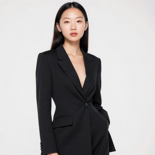
- Black: Authority, sophistication
By understanding these associations, you can make intentional choices that enhance your presence.
How Colours Influence Perception and Confidence
The right colours can:
- Improve perceived competence and professionalism
- Boost confidence in social or work settings
- Enhance attractiveness and approachability
Selecting shades that suit your skin tone and personal palette amplifies these benefits, ensuring that you feel comfortable and confident in every outfit.
The Role of Personal Colour Analysis in Style
A personal colour analysis helps identify:
- The colours that naturally complement your skin, hair, and eyes
- Shades that elevate your mood and projected confidence
- A palette that harmonizes your wardrobe for versatility
Combining psychological insights with your personal palette ensures you leverage both aesthetics and emotional impact in your fashion choices.
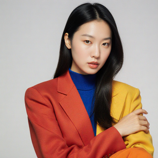
Applying Colour Psychology to Workwear
In professional settings:
- Neutral shades (navy, grey, beige) convey competence
- Accent colours (tie, pocket square, blouse) express personality
- Strategic use of bold colours can signal authority or creativity
A colour analysis service ensures your choices reinforce professional confidence without overpowering your appearance.
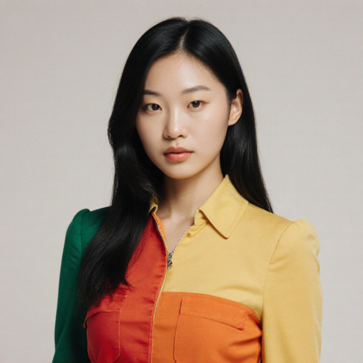
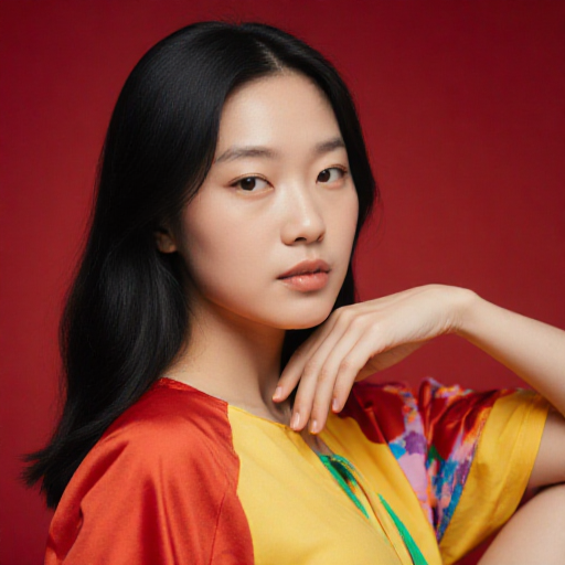
Choosing Colours for Social Settings
Social interactions benefit from:
- Warm, approachable colours to encourage connection
- Balanced colour palettes that reflect personality
- Harmonized combinations for group settings or photography
Using your personal palette prevents clashing or overstatement while maximizing positive impressions.
Impact of Colour on Mood and Productivity
Colours affect emotions and efficiency:
- Cool colours promote focus and calm
- Warm colours inspire energy and motivation
- Coordinated palettes reduce decision fatigue and stress
Intentional colour selection improves both mental well-being and productivity in daily life.
Using Colour in Accessories and Accents
Accessories provide opportunities to integrate colour psychology:
- Scarves, belts, and bags can inject confidence-boosting shades
- Coordinated jewellery enhances harmony and style
- Layering accents reinforces personal brand without overwhelming your look
Subtle integration ensures colours enhance your appearance psychologically and aesthetically.
Seasonal and Climate Considerations in Singapore
Singapore’s tropical climate influences how colours appear:
- Light, breathable fabrics for daytime heat
- Avoid overly dark shades that absorb sunlight
- Choose reflective or neutral tones for comfort while maintaining style
These considerations ensure both practical and psychological benefits from your colour choices.
Common Mistakes to Avoid
- Ignoring undertones and personal palette
- Overusing bold colours without balance
- Wearing colours unsuitable for context or climate
- Neglecting accessories as part of colour strategy
Avoiding these mistakes ensures your colour choices consistently enhance confidence and style.
How Virtual Colour Analysis Enhances Confidence
Virtual colour analysis consultations help you:
- Identify the colours that best support your psychological and aesthetic goals
- Strategically integrate shades into your wardrobe for work, social, and casual settings
- Optimize accessories, layering, and seasonal rotations
Professional guidance allows you to fully harness the power of colour to influence perception and self-confidence.
Conclusion
The psychology of colour plays a pivotal role in shaping confidence, style, and personal presentation. By understanding colour meanings and applying them in harmony with your personal palette, you can create a wardrobe that projects authority, approachability, and charisma. Leveraging a colour analysis service ensures that every shade you wear enhances both your style and emotional presence, making you look and feel your best in any situation.