Table of Contents
- Introduction
- What is Personal Colour Analysis?
- The Role of Colour in Professional Styling
- Benefits for Individual Clients
- Benefits for Corporate and Business Clients
- Integrating Personal Colour Analysis into Wardrobe Planning
- Selecting Colours for Professional Settings
- Enhancing Confidence Through Colour Choices
- Adapting Styles for Singapore’s Climate
- Common Mistakes in Professional Colour Styling
- How Virtual Colour Analysis Supports Styling Services
- Conclusion
Introduction
Professional styling services are no longer just about clothing trends—they focus on creating a cohesive and flattering look that reflects an individual’s personality and enhances confidence. One of the most effective tools in professional styling is personal colour analysis, which guides clients in selecting colours that complement their natural features.

A colour analysis service Singapore ensures that styling recommendations are precise, personalized, and practical for daily life.
What is Personal Colour Analysis?
Personal colour analysis identifies the colours that best suit an individual based on:
- Skin undertone and complexion
- Hair colour and brightness
- Eye colour
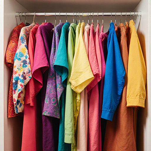
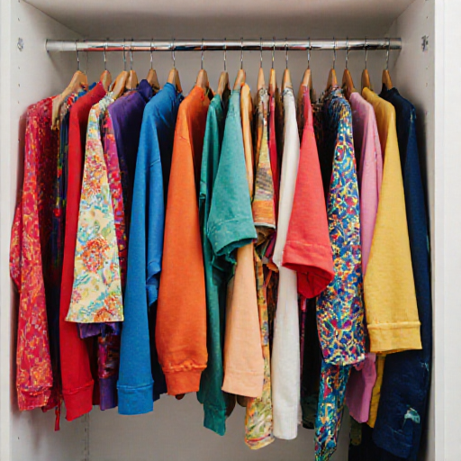
This analysis categorizes individuals into seasonal palettes—Spring, Summer, Autumn, or Winter—which simplifies colour selection for clothing, accessories, and even makeup.
The Role of Colour in Professional Styling
Colour significantly impacts:
- Perceived confidence and authority
- Overall cohesion and elegance of an outfit
- Visual communication in professional settings
Using the right colours ensures clients present themselves effectively in interviews, meetings, and corporate environments.
Benefits for Individual Clients
Personal colour analysis helps clients:
- Highlight their natural features with flattering shades
- Avoid colours that clash with skin tone or hair
- Build a versatile and harmonious wardrobe
This not only saves time and money but also boosts confidence in everyday and professional interactions.
Benefits for Corporate and Business Clients
For corporate clients:
- Ensures employees’ attire aligns with company branding while complementing individual features
- Creates a cohesive and professional appearance across teams
- Enhances overall workplace aesthetics and morale
Styling services that incorporate colour analysis offer measurable benefits in professional environments.
Integrating Personal Colour Analysis into Wardrobe Planning
A professional stylist can:
- Assess clients’ current wardrobe for palette compatibility
- Recommend new pieces that align with seasonal colours
- Suggest transitional shades to maximize outfit versatility
This strategic approach ensures clients maintain a polished, flattering wardrobe year-round.
Selecting Colours for Professional Settings
Key considerations include:
- Neutral base colours for suits, trousers, and skirts
- Accent colours that highlight personality without being distracting
- Palette-compatible accessories, shoes, and jewellery
Correct colour choices project competence, style, and confidence simultaneously.
Enhancing Confidence Through Colour Choices
When clients wear colours that complement their features:
- Their skin appears healthier and brighter
- Outfits look cohesive and intentional
- Confidence naturally increases in both personal and professional settings
Colour analysis empowers clients to make informed choices that enhance their presence.
Adapting Styles for Singapore’s Climate
Singapore’s tropical climate requires attention to:
- Lightweight and breathable fabrics in palette-appropriate colours
- Sun-safe shades that minimize colour fading or discomfort
- Versatile layering options for work, social, and casual settings
Professional styling services integrate these factors to ensure style and comfort coexist seamlessly.
Common Mistakes in Professional Colour Styling
- Selecting colours solely based on fashion trends without considering personal palette
- Overloading outfits with too many accent colours
- Neglecting accessories that could enhance palette harmony
- Failing to adjust colours seasonally or with changing personal features
Avoiding these errors ensures a consistent, professional, and flattering appearance.
How Virtual Colour Analysis Supports Styling Services
Virtual consultations offer:
- Accurate assessment of personal colour palette remotely
- Guidance on wardrobe updates, accessory choices, and professional attire
- Personalized recommendations for both individual and corporate clients
Leveraging a colour analysis service allows stylists to provide efficient, precise, and client-focused solutions.
Conclusion
Incorporating personal colour analysis into professional styling services enhances client satisfaction, confidence, and overall appearance. By understanding natural colouring and selecting colours that complement features, individuals and corporate clients alike can achieve a polished, cohesive, and professional look. Utilizing a colour analysis service Singapore ensures styling recommendations are tailored, practical, and effective, helping clients present their best selves every day.